Hi.dozo
Empowering home-cooks by selling their authentic home-cooked food to local customers.
2019 — 2020
Overview
Hi.Dozo serves as a C2C platform connecting home chefs with local customers in Japan, addressing the needs of both groups. By offering a solution for customers seeking delicious homemade meals and individuals looking to earn extra income by sharing their culinary skills, we aim to alleviate daily challenges for both parties. This initiative emerged from a conversation in Japan and evolved into a problem-solving business. While external circumstances, such as the pandemic, prevented us from reaching the MVP stage, we remain hopeful that this project can persist and flourish in the future.
Role
Product Designer
Responsibilities
Product Design
Product Strategy
Branding
Team
Shenghua Hsiao, Co-founder
Narrative
In Japan, a prevalent lifestyle sees mothers juggling the responsibilities of homemaking, child-rearing, and part-time employment, effectively managing three full-time roles. The primary challenge that surfaced was how to support these multitasking individuals and establish a seamless customer-to-customer business model that caters to their unique needs.
Problem, Key Question and Goal
The Problem
• Limited income-generating opportunities for stay-at-home parents, particularly housewives.
• Lack of a platform or community to support home cooks in sharing and selling their homemade meals.
• The absence of a user-friendly app and website for home cooks to connect with potential customers.
Key question
How might we support stay-at-home parents, especially housewives, in their pursuit of income generation while taking care of children?
How might we create a platform that empowers home cooks to share and sell their authentic home-cooked meals effectively?
Goal
• Enable a new community of home cooks to sell their homemade dishes through a user-friendly app and website.
• Establish a community for stay-at-home parents, particularly housewives, to support their income generation while caring for children.
• Address the overworking culture and its impact on the Japanese economy by empowering individuals to contribute to their households without sacrificing family responsibilities.
The Process
Research
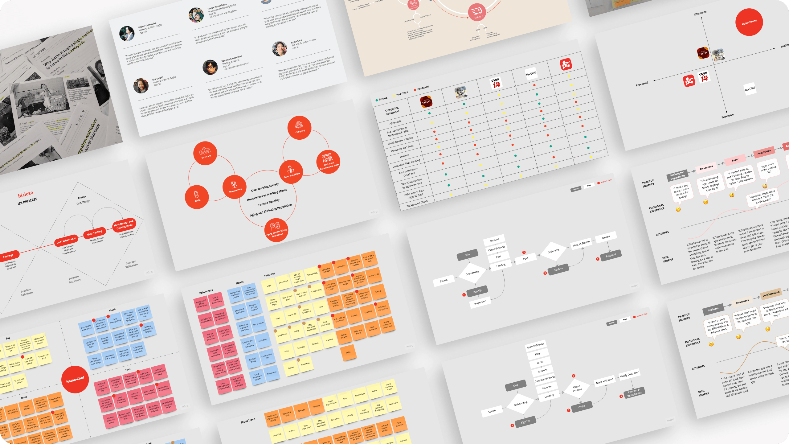
Our process at Hi.dozo is based on the Double Diamond Theory and Lean UX process. We aim to incorporate the key phrases of Discovery, Definition, Ideation, and implementation in our business model.
Summary:
• Double Diamond Theory and Lean UX Process
Discover & Define: Ask, Listen, Sort
• Research — Clarifying Problem, Primary, Secondary, Problem Cycle
• Findings — Observation, Opportunity, Ecosystem
• Ideate & Implement: Create, Test, Design
• Lo-Fi Wireframe — User Scenario, Wireframe and Flow Iteration.
• User Testing — Testing through Interviewers.
• Hi-Fi Design and Development — Final Wireframe.
Following the identification of opportunities, we conducted competitor analysis and positioning mapping to assess our position in comparison to other companies. Subsequently, we developed an empathy map for home chefs and customers, enabling us to compile a comprehensive list of potential features. We then used a MoSCoW Chart (Must-have, Should-have, Could-have, Won't-have for now) to prioritize essential features for both user groups. User testing was carried out to evaluate the main app flow for home chefs and customers, resulting in the creation of user journey maps for both cases. Finally, we designed the hi.dozo app while aligning it with our identity system.
Gathering Insights
• Many stay-at-home parents, particularly housewives, often find themselves limited in their options for earning income while caring for their children.
• The primary breadwinners in households often experience guilt when allocating money for personal needs due to the responsibility of providing for the family.
• Japan's overworking culture has far-reaching effects on the country's economy, including challenges such as an aging population, declining birth rates, and a high suicide rate.
Identity System & Design System
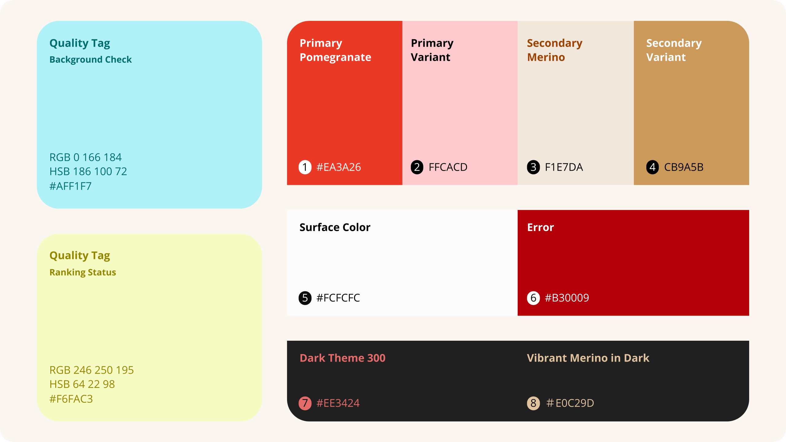
Identity System
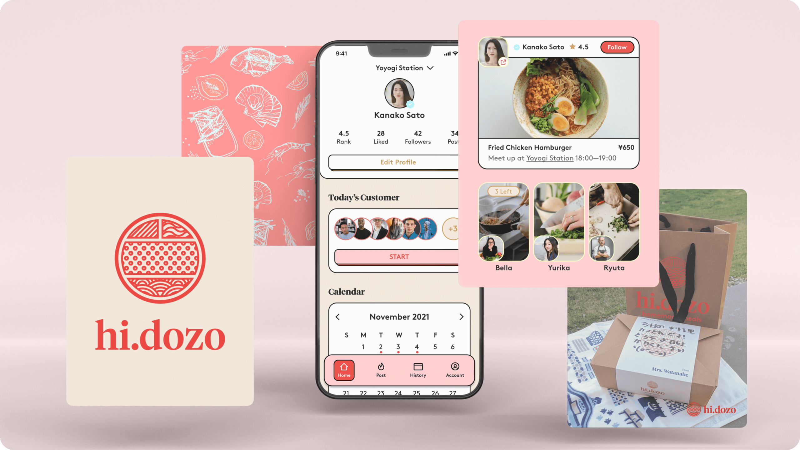
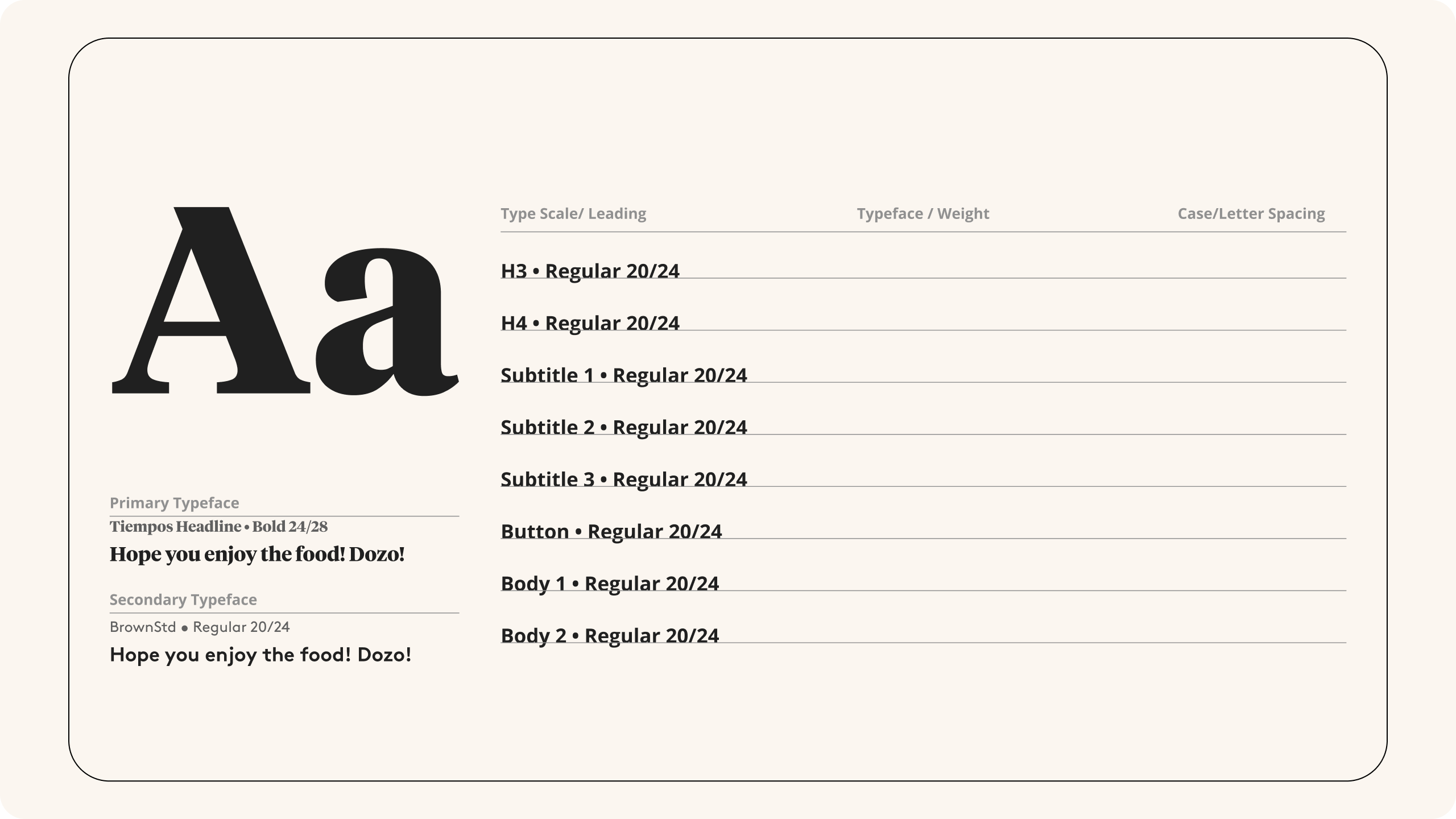
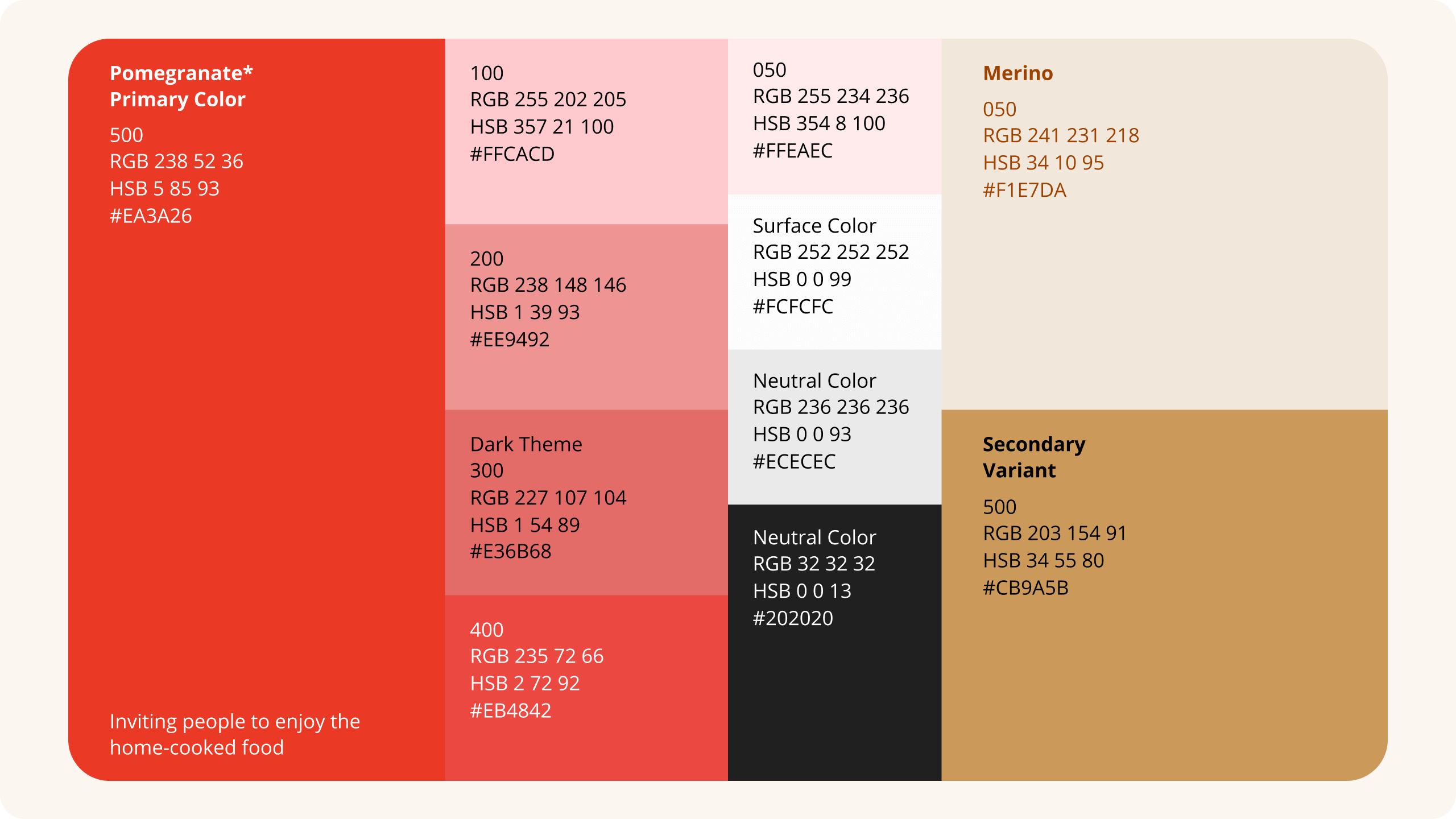
In the process of branding Hi.Dozo, I designed the logo mark to resemble a top view of a bento box. Bentos are known for their divided sections, using various patterns to represent different dishes. Our choice of a combination of sans-serif and serif fonts aimed to create a warm and welcoming typeface that reflects the friendly nature of the chefs. We selected a primary color palette featuring pomegranate, evoking an inviting, warm ambiance, while the secondary color, merino, enhances this welcoming feel. The harmony of typography and color not only captures the essence of sharing home-cooked meals but also resonates with the concept of delivering delicious food to office workers.
Components
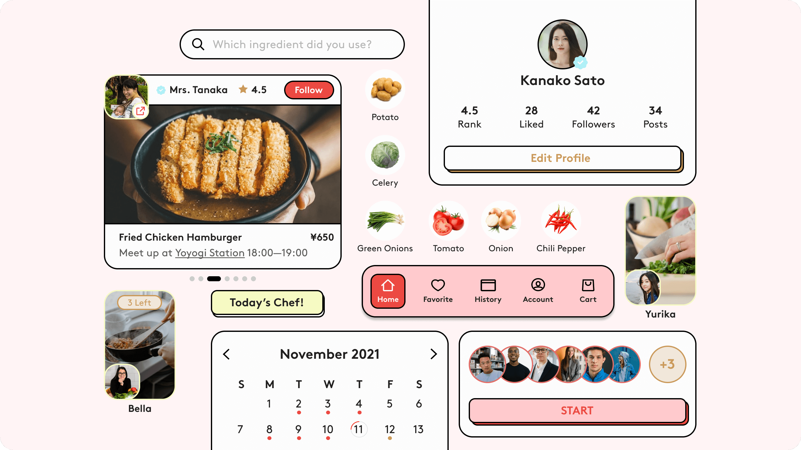
The design components I developed for the app incorporated a 2D visual style, characterized by bold outlines and a lively, cartoon-like appearance. This choice of design was deliberate, as it aimed to create an inviting and approachable atmosphere within the app's interface. The use of bold outlines in the design elements added a sense of clarity and distinctiveness to various app features.
Notably, the design components for both customers and chefs were aligned with the overarching branding strategy of Hi.Dozo. This consistency in design language ensured a cohesive and harmonious user experience. The visual elements within the app, with their cartoon-like aesthetics, contributed to the overall appeal of the platform, making it not only functional but also engaging and user-friendly.
Home- Chefs and Customers Screen
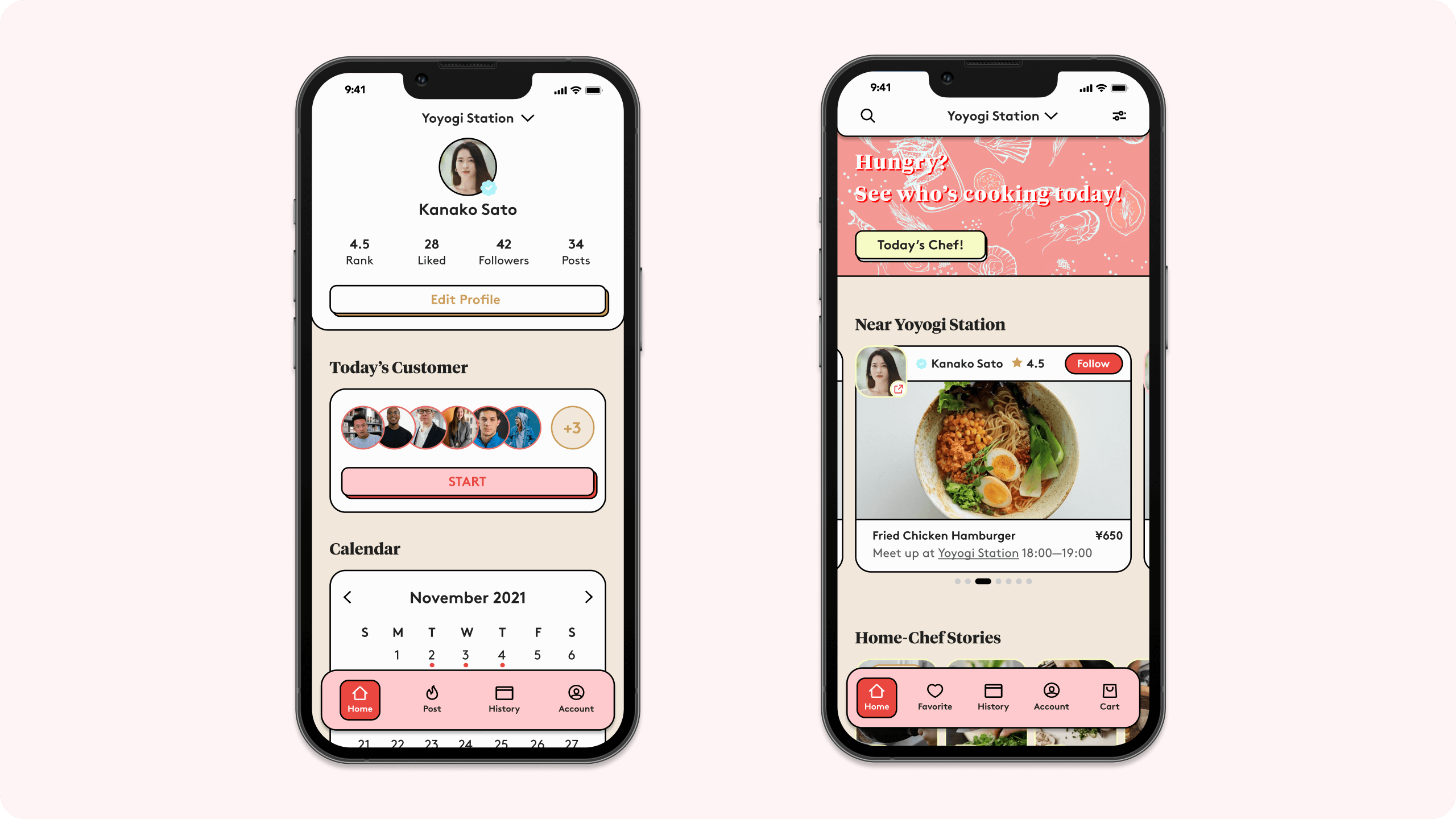
The Hi.Dozo app serves as the core of our platform, seamlessly bridging the connection between home chefs and customers. With an intuitive and user-friendly interface, it empowers home chefs to present their culinary creations, while simultaneously providing customers with an extensive array of homemade dishes to explore. The app offers distinct landing pages tailored to the unique needs of each user group.
For home chefs, the landing page is thoughtfully designed with a systematic approach, simplifying their daily tasks and preparations. It offers a clear overview, allowing chefs to efficiently plan their day.
On the other hand, customers are welcomed with a dynamic landing page that introduces them to a world of diverse chefs, dishes, and the captivating stories behind each creation. Customers can explore a wide range of dishes, select their preferences, and even track their culinary journey to see the chefs they've supported and the savings they've made. This duality of landing pages ensures a seamless and personalized experience for both home chefs and customers.
Story Boarding
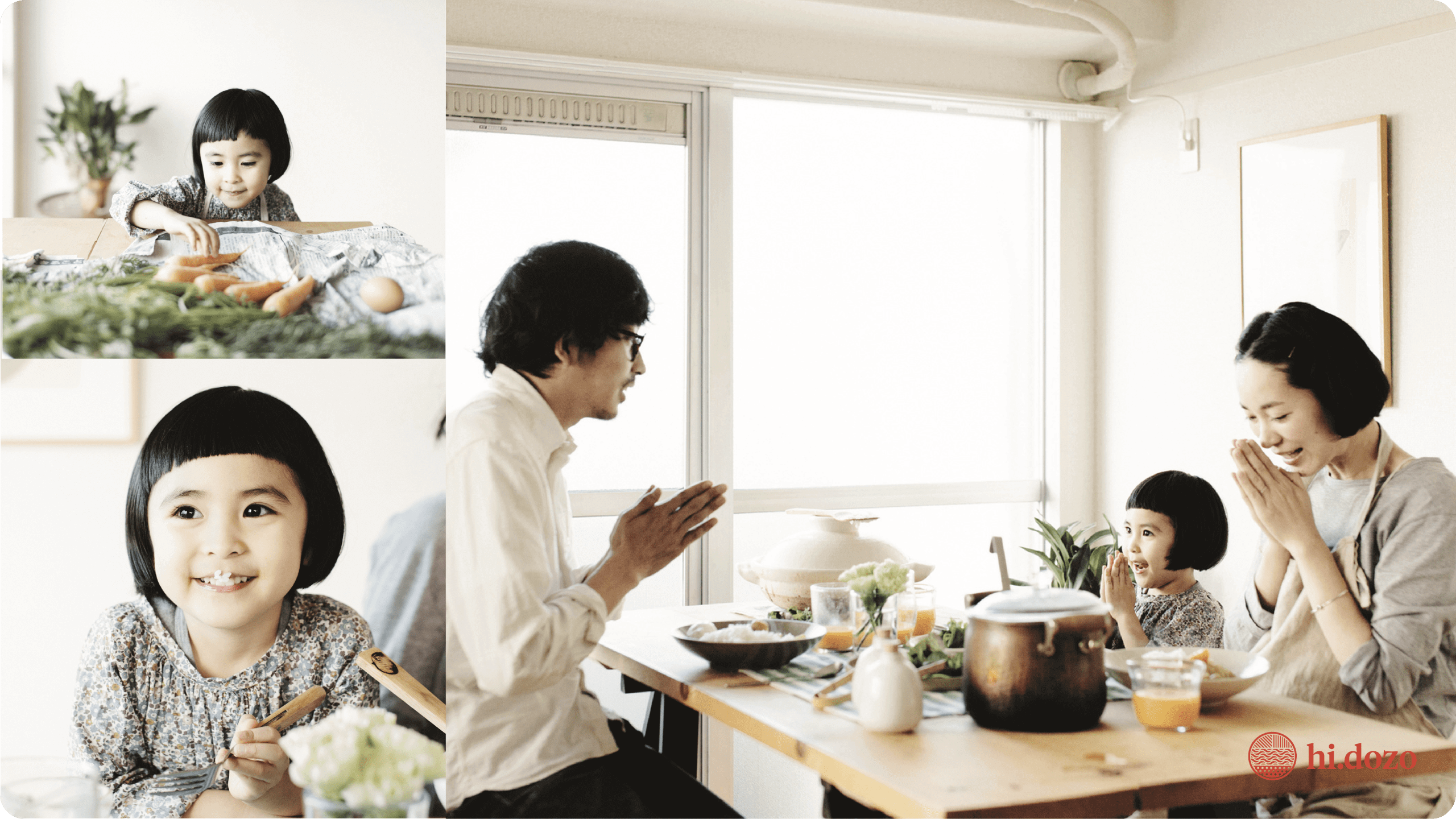

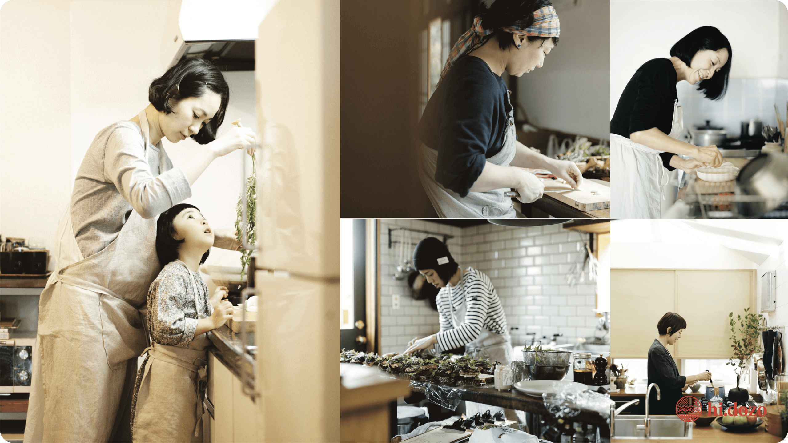

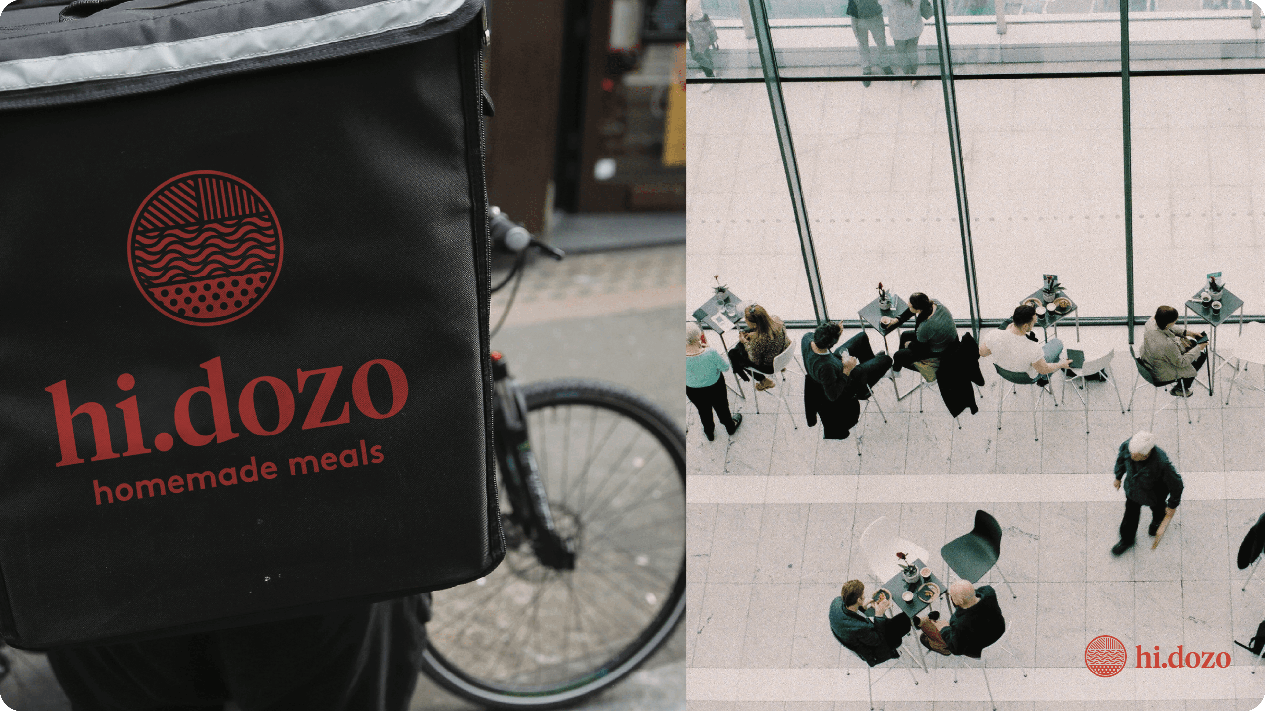
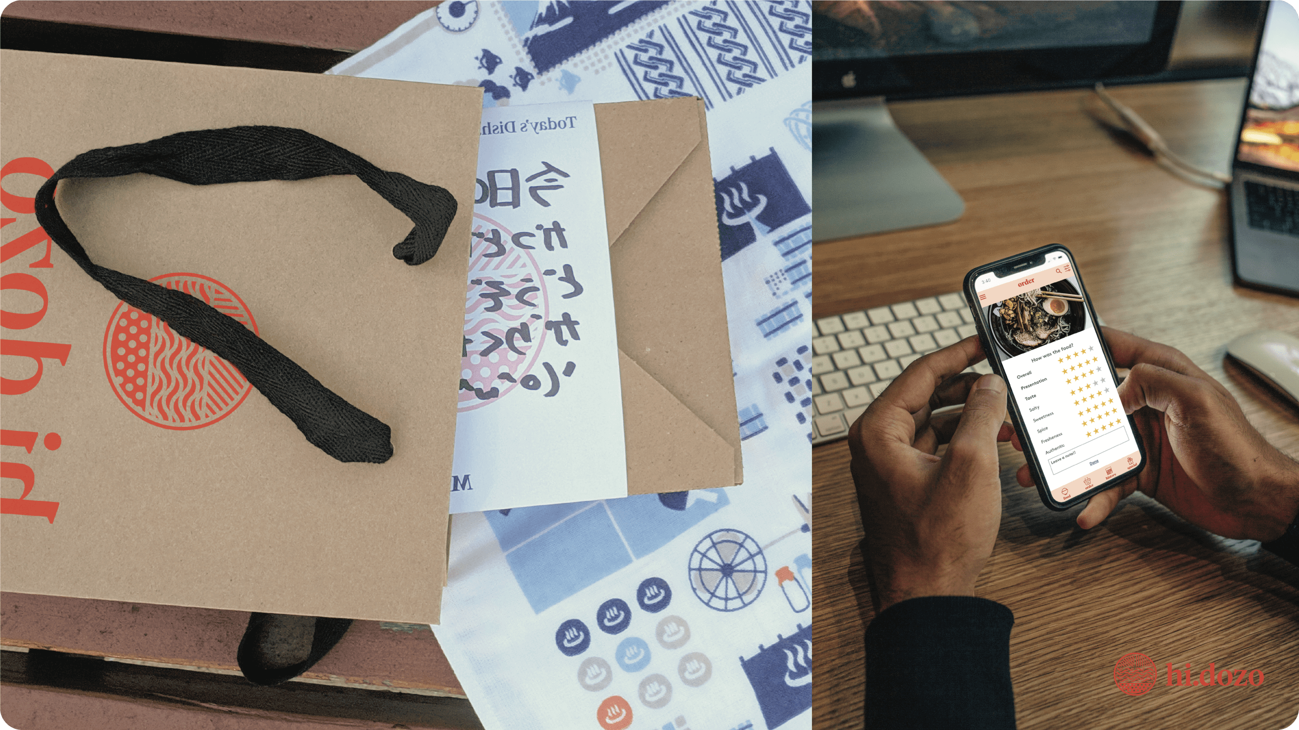
Journey of the day
As the sun rises over Tokyo, families share breakfast, setting the day's warm tone. Simultaneously, dedicated home chefs craft personalized breakfasts for busy workers seeking a break from routine. The chefs pack and deliver their creations to customers around the city, infusing variety into the workday. Customers eagerly receive and savor the unique meals, expressing gratitude through reviews. This daily cycle transforms mornings into a flavorful journey, connecting chefs' passion with customers' desire for culinary exploration in the heart of bustling Tokyo.
Validating Concept
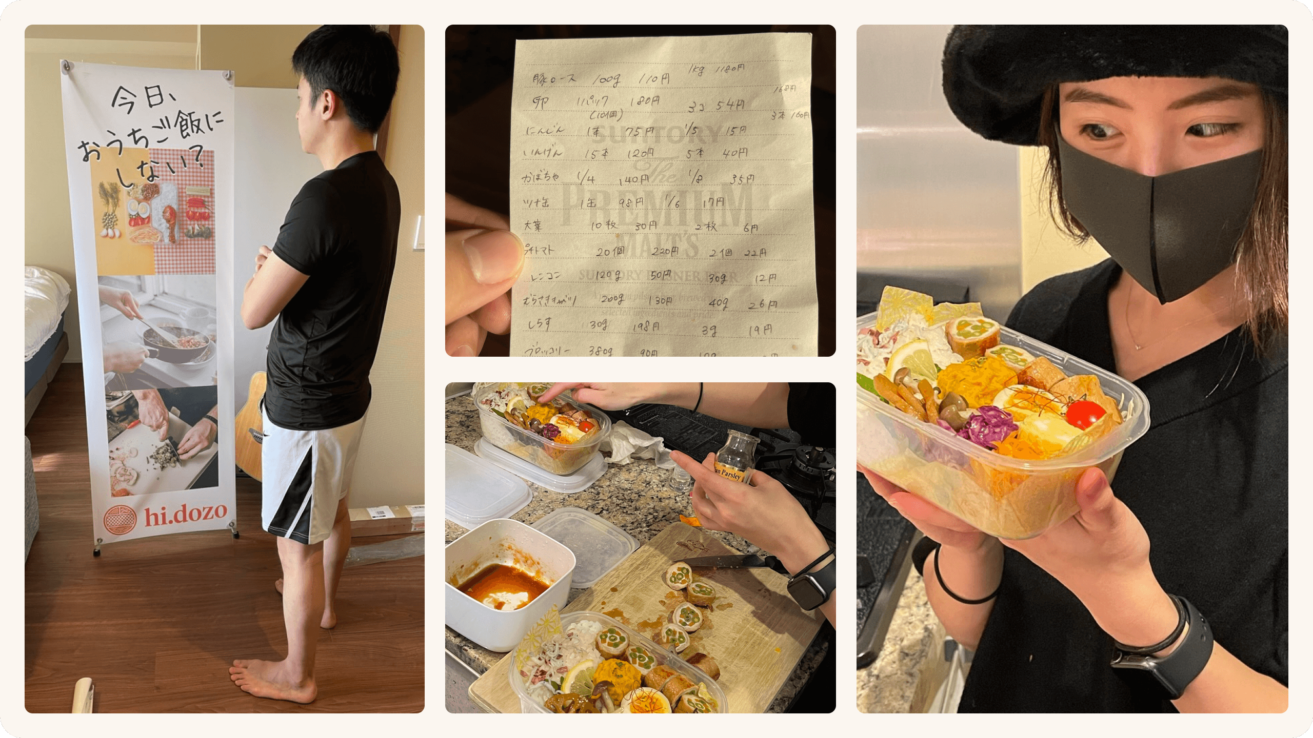
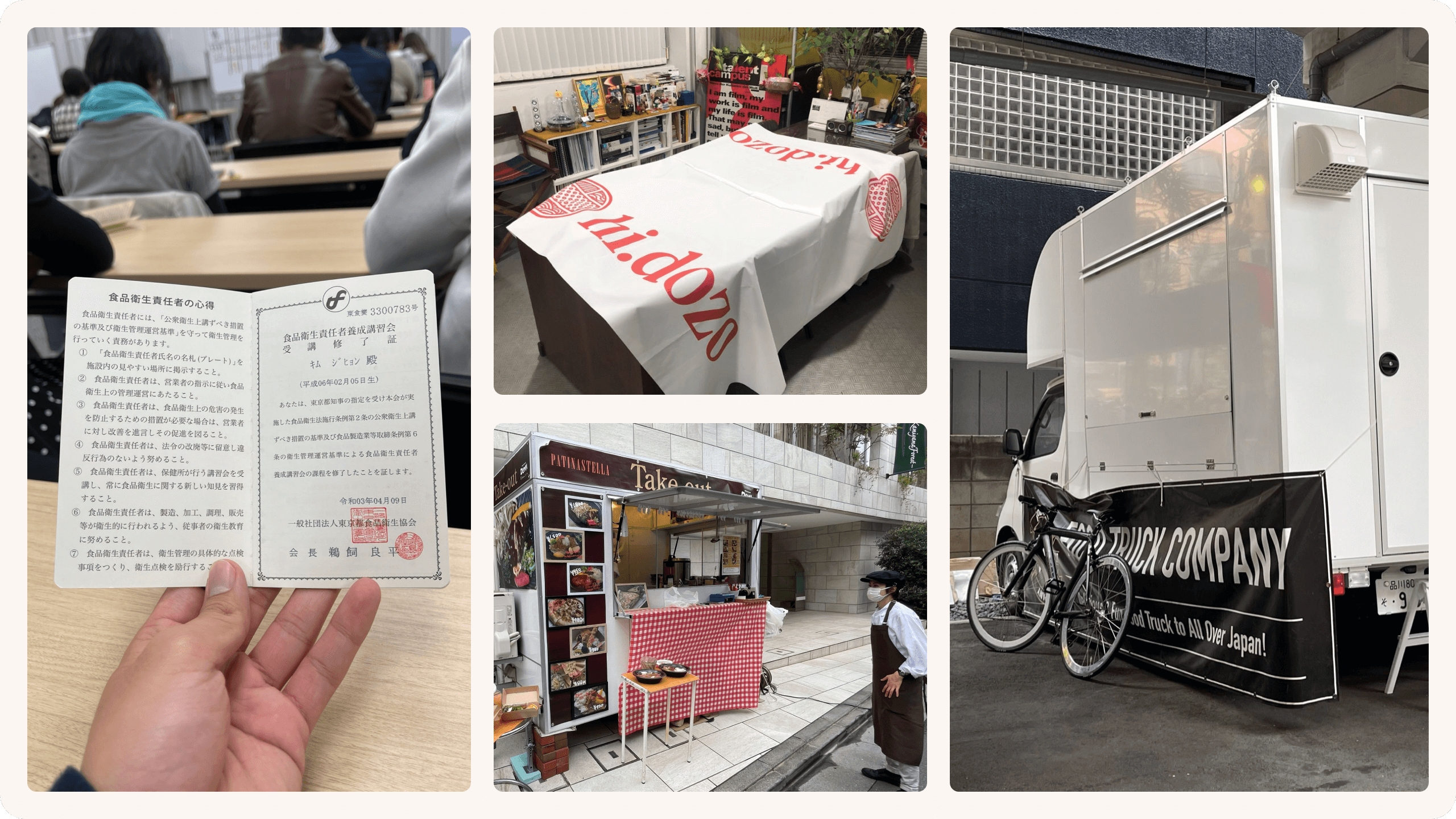
Testing our concept
In the process of validating our concept, we engaged home chefs from our personal network and introduced their offerings to our coworkers in their office settings. This pivotal stage enabled us to assess the demand for our idea, with the substantial feedback we received validating a genuine need for this concept. Our subsequent move involved collaborating with food trucks, allowing us to procure home-cooked meals in bulk from our chefs and offer them to office workers conveniently right in front of their workplaces.
Concept to Reality
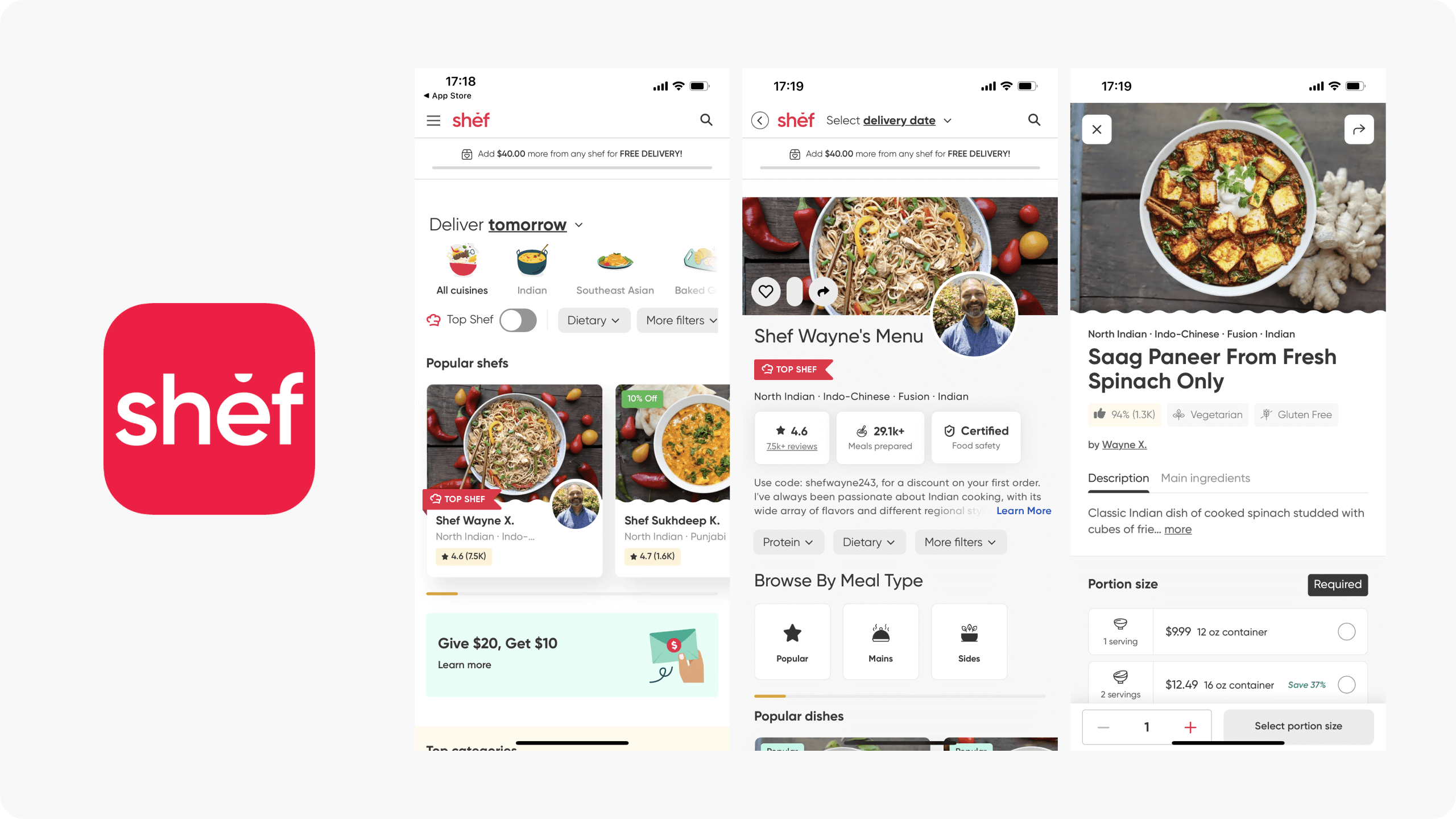
Shef Company
Regrettably, our concept was put on hold in 2020 due to the pandemic. Interestingly, in 2019, Shef independently initiated a similar concept, ultimately securing funding from Y Combinator in 2022 in the United States. Witnessing an idea we had contemplated materialize a few years later was both surprising and affirming. It's gratifying to see the concept we envisioned take shape.
Selected Works
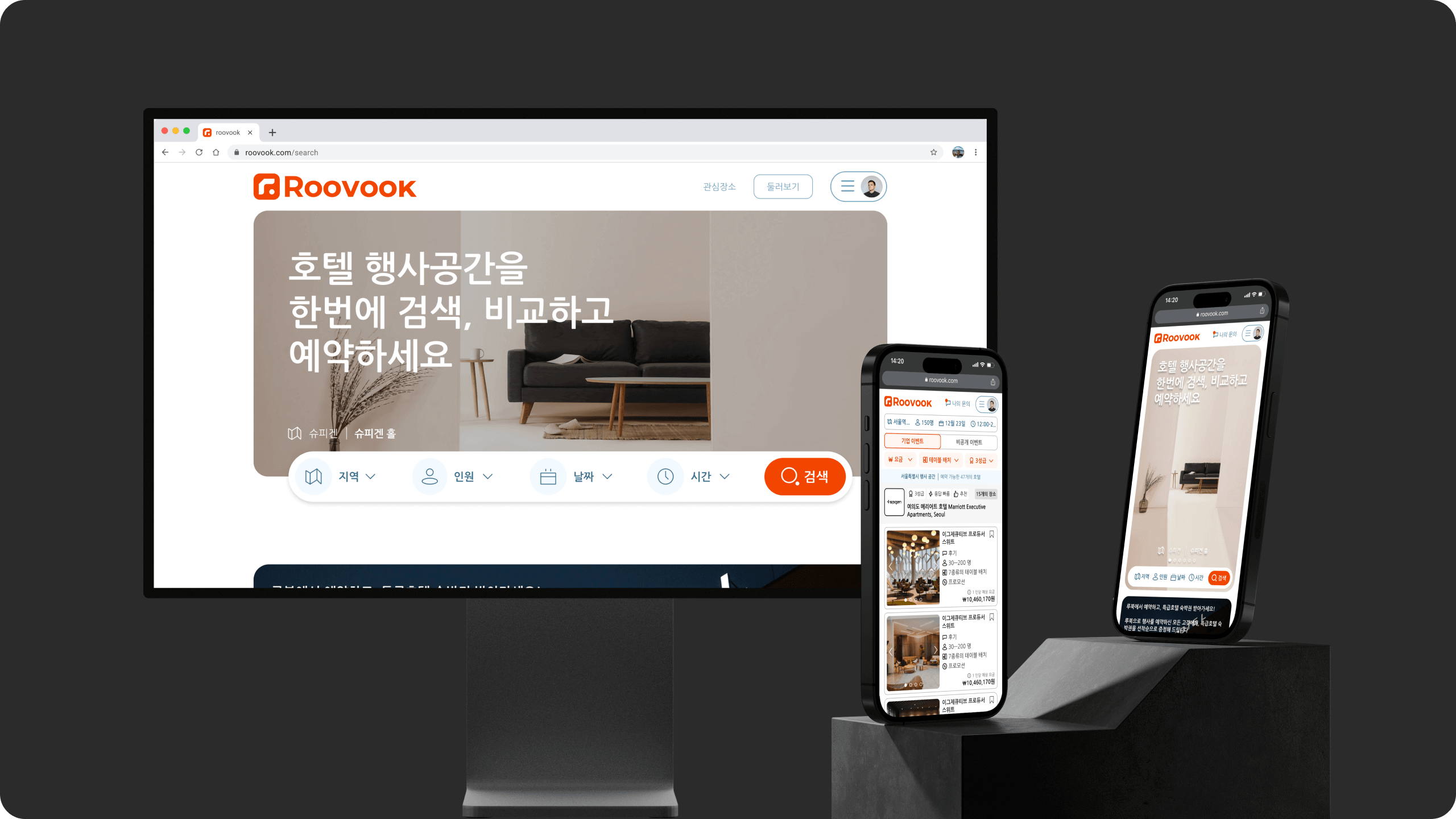
RoovookProduct Design

hidozoProduct Design
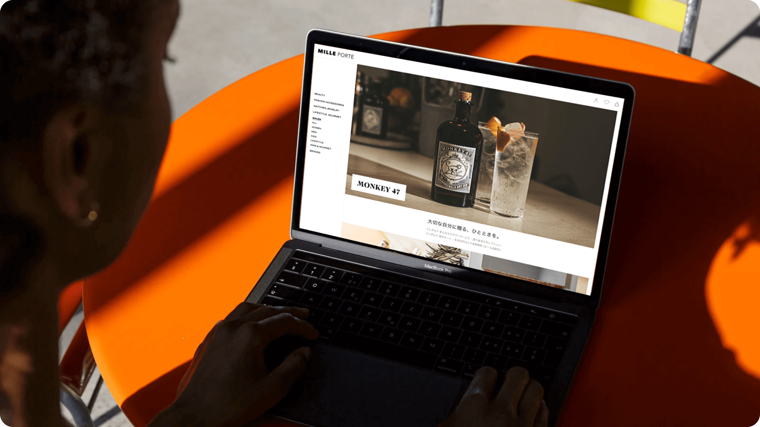
MilleporteProduct Design
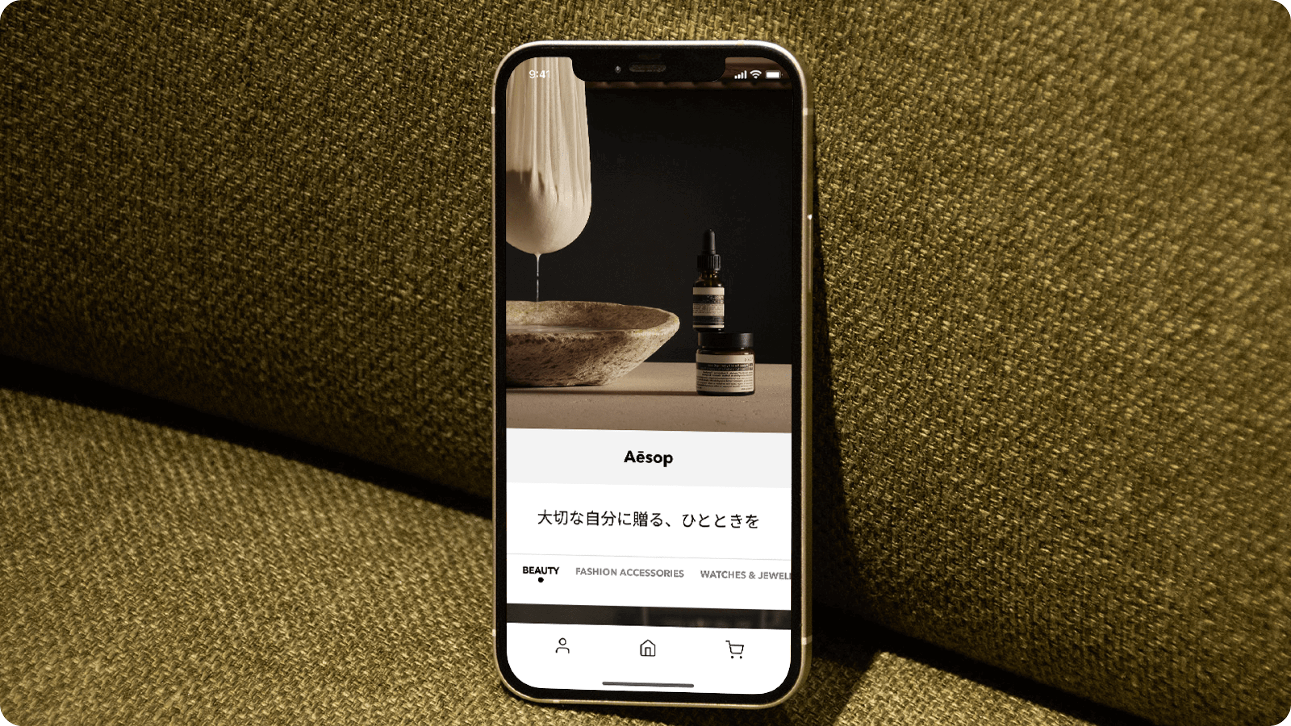
Milleporte iOS AppProduct Design
Ji Kim
Product Designer
© 2023
