An eCommerce company based in Tokyo that modernizes the digital shopping outlet for over 4,000 brands.
November 1, 2019 — June 1, 2022
Overview
MillePorte received an investment of $27M from their main investors, Goldman Sachs, and Itochu, in 2019 for the Series B round. The company restructured the team and saw 30 people leaving the company as well as a new team of 20+ people joining the company between the end of November 2019 to mid of 2020. As a product designer, I had a crucial role in executing the responsive website, developing B2B family sales, and designing the iOS App.
Role
Product Designer
Responsibilities
Product Design
Product Strategy
Brand Experience
Team
Kyle Barrow, Product Manager
Olivier Bigarini, Creative Director Olivier Mayer, Lead Front End
Crisler Chee, IOS Engineer
Narrative
Prior to securing investment, Milleporte focused on championing smaller, lesser-known brands, setting them apart from mainstream fashion trends. The next strategic move for the company was to enter the arena of larger competitors, catering to users seeking high-end brands.
Following the acquisition of their main competitor, Guilt Japan, by another firm, a significant number of former Guilt Japan employees joined Milleporte following their successful Series B funding round. I had the privilege of being a part of this transition, where our team was tasked with modernizing the e-commerce website and seamlessly integrating high-end brands into the existing platform.
Challenge, Key Question, and Goal
Challenge and Opportunity
Balancing High-End and Smaller Vendors: The challenge lies in effectively integrating high-end brands while continuing to uplift smaller, lesser-known vendors, striking a harmonious balance between the two.
Outdated End-to-End Experiences: The existing end-to-end user experiences suffer from outdated structural and interface elements, hindering the platform's competitiveness in the market.
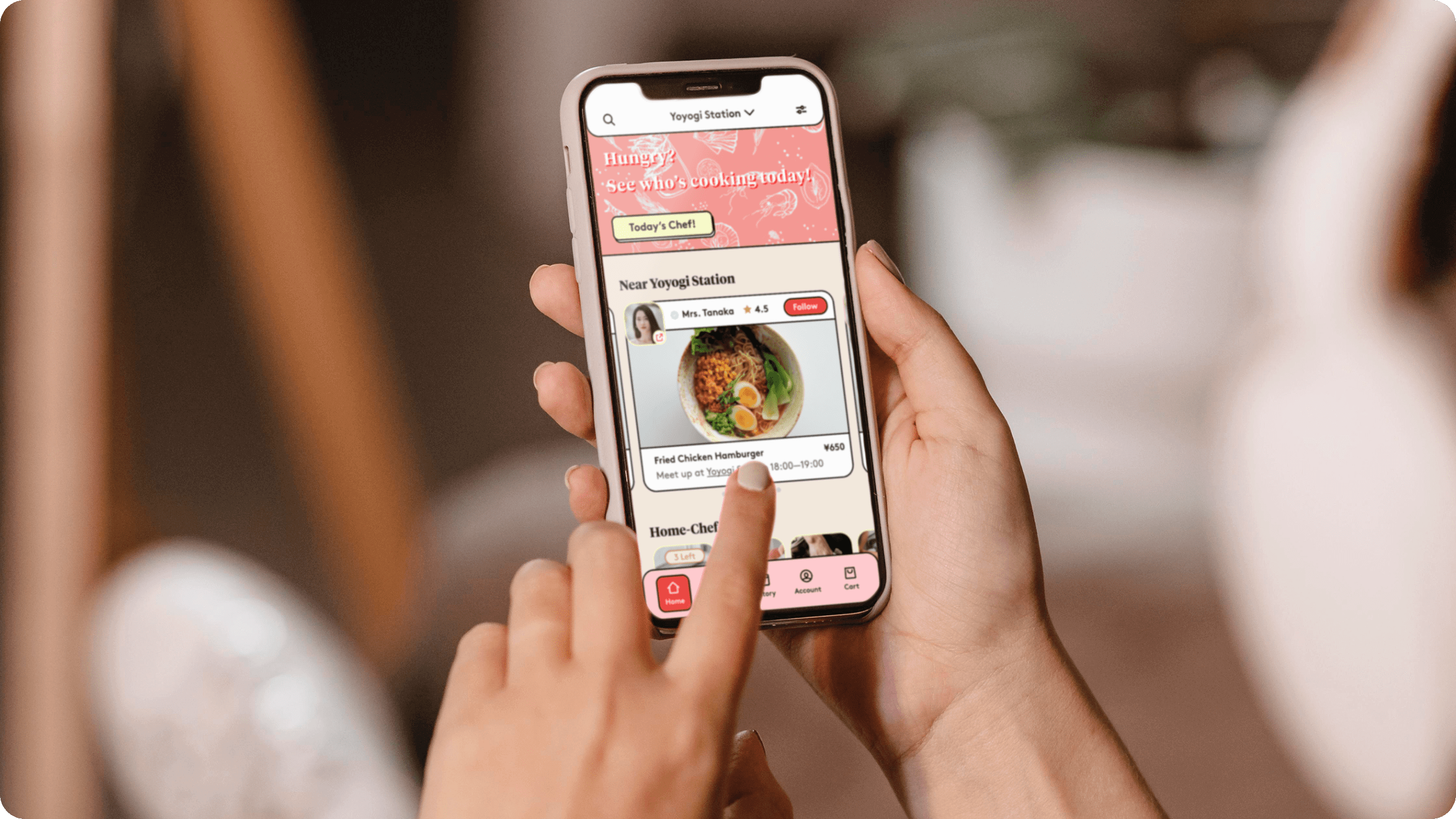
Unfriendly Mobile User Experience: The mobile platform currently offers a suboptimal user experience, necessitating significant improvements to make it more user-friendly and responsive.
Inventory Management for High-End Brands: High-end brands present unique inventory management challenges that need to be addressed to ensure a seamless customer experience.
Key question
• How might we strike a balance that uplifts smaller vendors while attracting high-end clientele to our platform?
• How might we enhance inventory management for high-end brands while modernizing the end-to-end user experience?
• How might we make the mobile platform more user-friendly and responsive for seamless navigation and engagement?
Goal
Enhance Vendor Integration and User Appeal:
• Foster trust and credibility among users by effectively integrating high-end brands while continuing to support and uplift smaller vendors.
• Attract and educate users about the benefits and unique offerings of both high-end and lesser-known brands, encouraging a diverse shopping experience.
Design User Experience:
• Modernize the end-to-end user experiences, including the structure and interface, to align with current industry standards and enhance user engagement.
• Make the mobile platform more user-friendly and responsive, ensuring a seamless and efficient user journey.
Streamline Inventory Management:
• Optimize inventory management for high-end brands to ensure consistent product availability and avoid overstock situations.
• Implement a robust inventory tracking and demand forecasting system to improve efficiency and minimize product shortages.
Strategy & Kick Off
Understanding the company
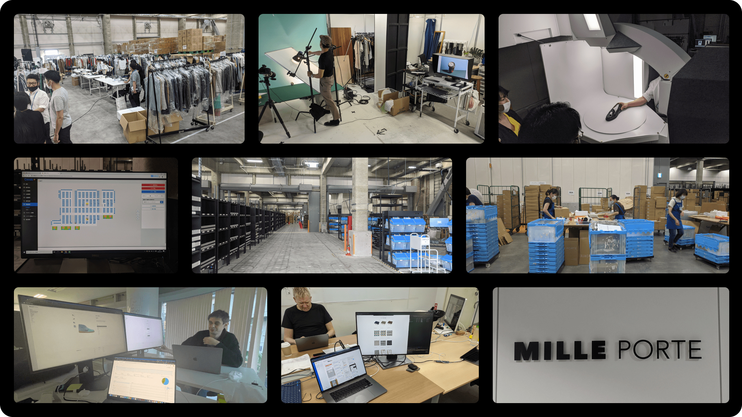
At the outset, we conducted a thorough exploration of every team within the company, delving deep into its organizational structure. Our primary objective was to gain a comprehensive understanding of the company's workflow, specifically how products are curated, uploaded, and processed upon sale. We critically examined each step in this process, seeking opportunities for streamlining and enhancing the overall user experience from the digital realm through to the final shipment of products.
The Process
Collaboration
For User Experience, I worked closely with product manager, Kyle, and for User Interface I worked closely with creative director Olivier. The product manager and I concentrated on improving the current website. We worked together to create a detailed plan for our upcoming projects throughout the year, and we organized these tasks using Jira for smooth execution.
reframe the statement… you were the designer who collaborated with the product manager.
Research & Analysis
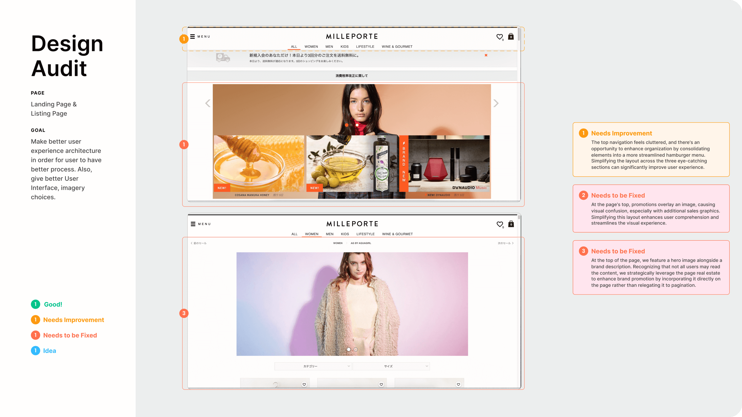
1. UX Audit: I conducted a thorough assessment of the existing website, juxtaposing its performance against industry benchmarks and best practices. This analysis unveiled key pain points and opportunities for enhancement.
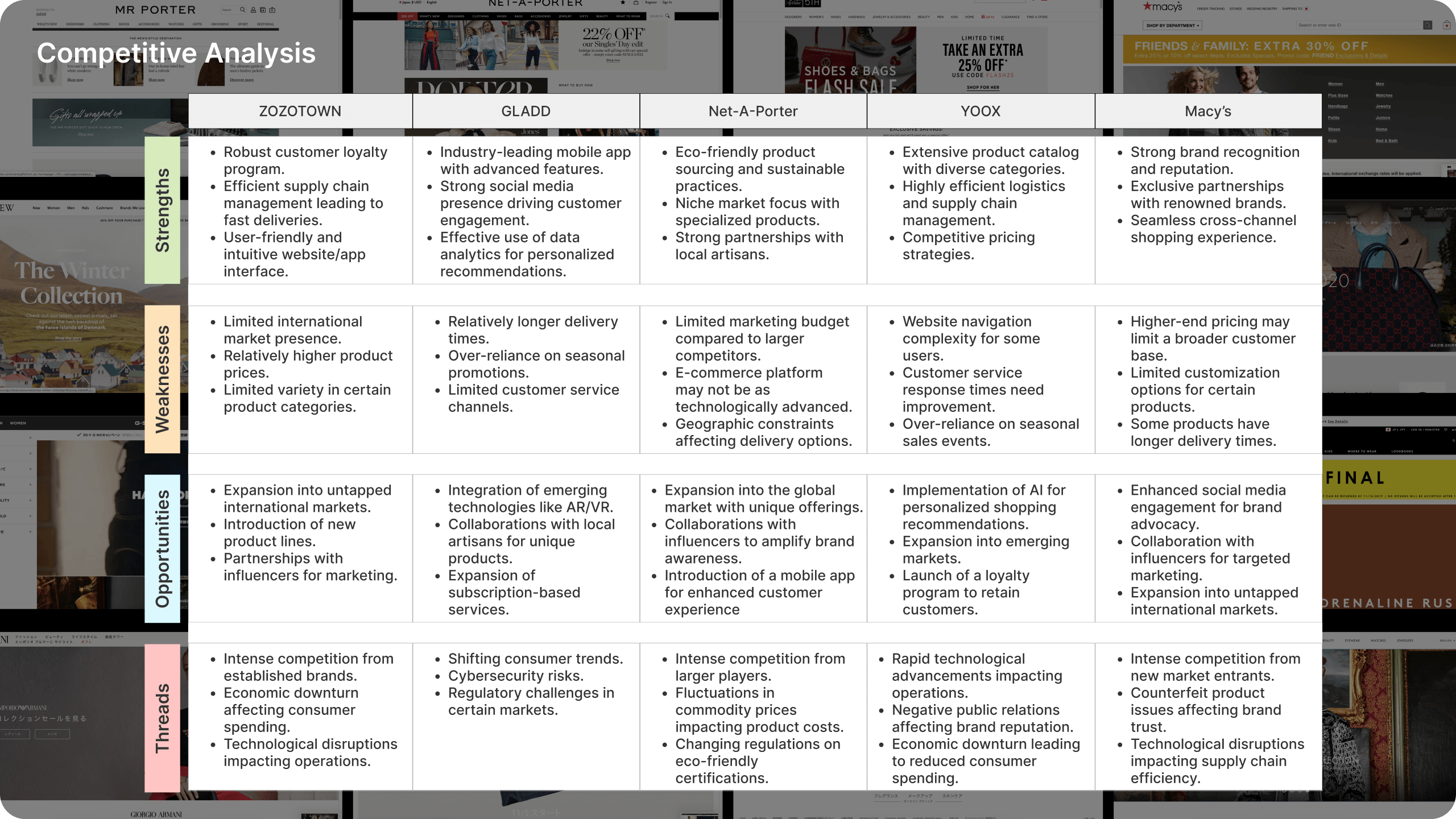
2. Competitor Analysis: I studied what other companies in our industry were doing. I looked at their websites and apps to understand what ideas were popular and what made them stand out. This gave us a big picture of what's happening in the industry.
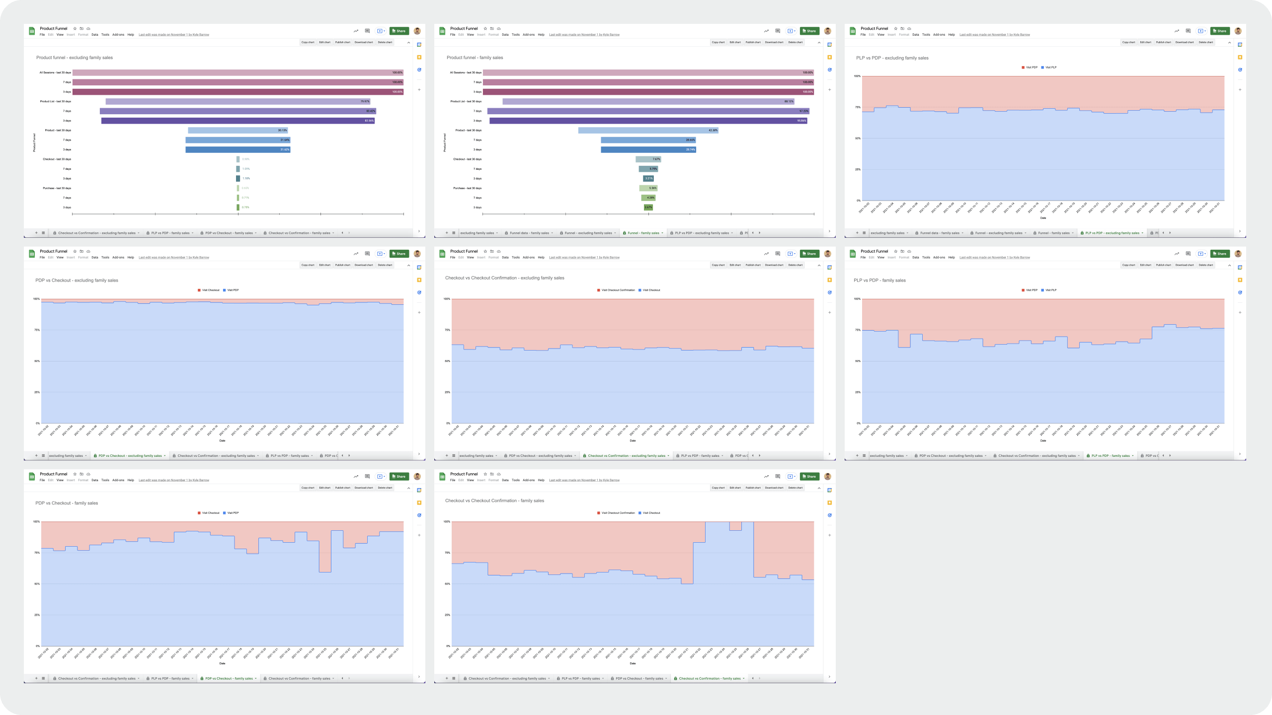
3. Analytics and Data Analysis: Harnessing the power of data, we delved into website analytics to decode user interactions, preferences, and pain points. This empirical approach fortified our decision-making.
4. User Research: Utilizing Google Analytics helped us with our demographics, behavior patterns, and avenues to broaden user engagement. It was interesting to see users using the product during transportation.
5. User Journey Mapping: A comprehensive evaluation of the existing user journey versus the redesigned user flow was executed. This illuminating process spotlighted areas for streamlining and optimizing the overall user experience.
Gathering Insights
Mobile vs. Desktop Usage: Our users frequently engage with our platform during peak commuting hours, around 9 a.m. and 6 p.m., while on their way to the office. Recognizing this trend, we aimed to enhance the mobile experience, ensuring a seamless and user-friendly interface to accommodate their shopping needs on the go.
Abandoned Carts: We observed a pattern where shoppers initiated the cart process on mobile but postponed finalizing the purchase on desktop. However, due to the fleeting nature of flash sales, some users would forget or miss out on items. This prompted us to implement strategies that minimize cart abandonment and maximize user satisfaction.
Transparency: Our rules about shipping, returns, and security were hard to find because they were hidden in small dropdowns on the product pages. This made people unsure about buying things, and it even made some not want to buy at all, which made our conversion rate lower.
Customer Loyalty and Repeat Purchases: We noticed that when brands tell their stories well and show good pictures, people trust them more. This makes people want to keep buying from those brands because they know they're good.
Prioritzation
While everything was changing in the company, we prioritized fixing the current website.
1. Fixing the current website for the holiday sales
2. Rebranding and introducing luxury brands on the newly redesigned website with current flash sales.
3. Family Sale helping luxury brand inventory management.
4. Working with iOS developer to launch iOS application.
New Identity

New Identity
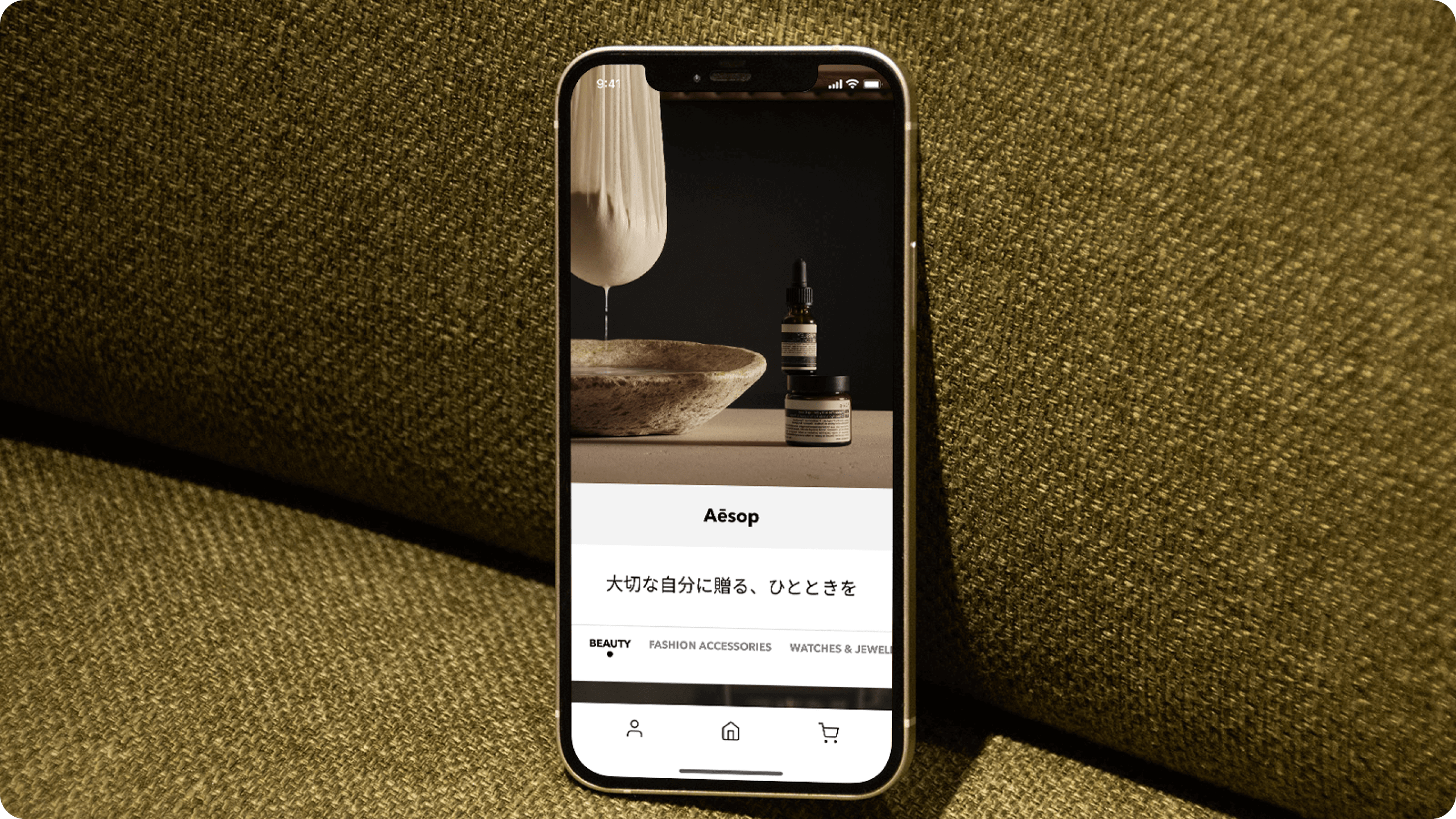
Milleportes' fresh branding approach served as a blank canvas. With the challenge of hosting multiple brands on our website, we recognized the potential for clutter with a wide array of colors. By adopting a black-and-white palette and adopting a canvas-like role, we succeeded in elevating and complementing the presence of other brands.
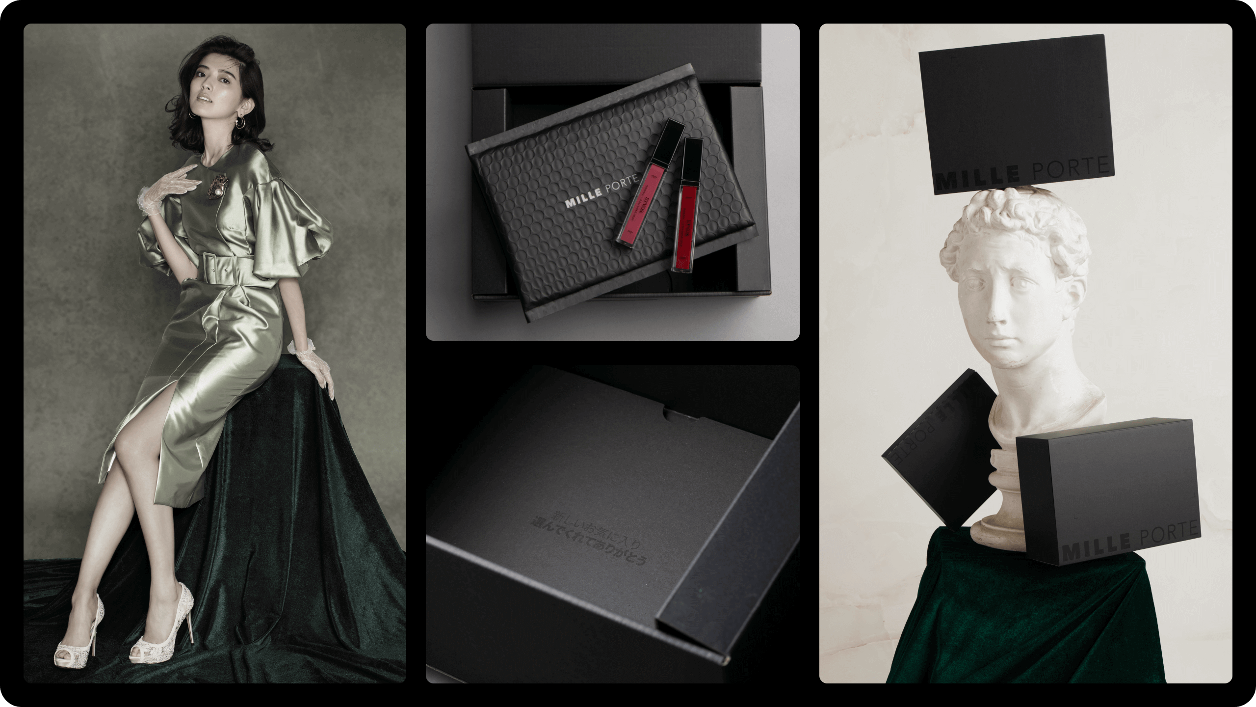
Packaging
The canvas-inspired branding extends seamlessly to our packaging design. Its sleek, all-black appearance ensures a consistent and harmonious transition from the digital realm to the physical. The emphasis on high-quality packaging was of paramount importance to us.
New Website
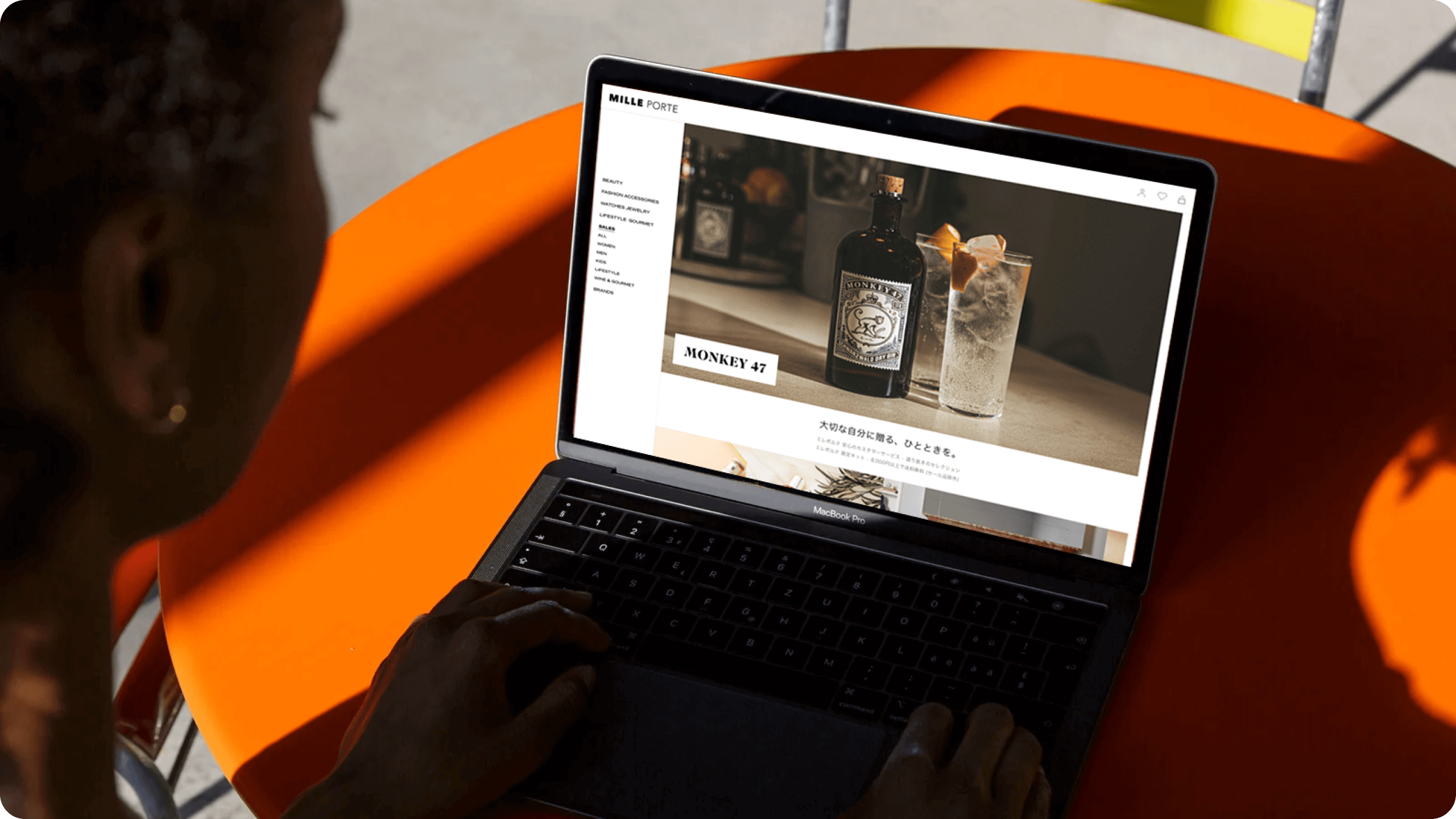
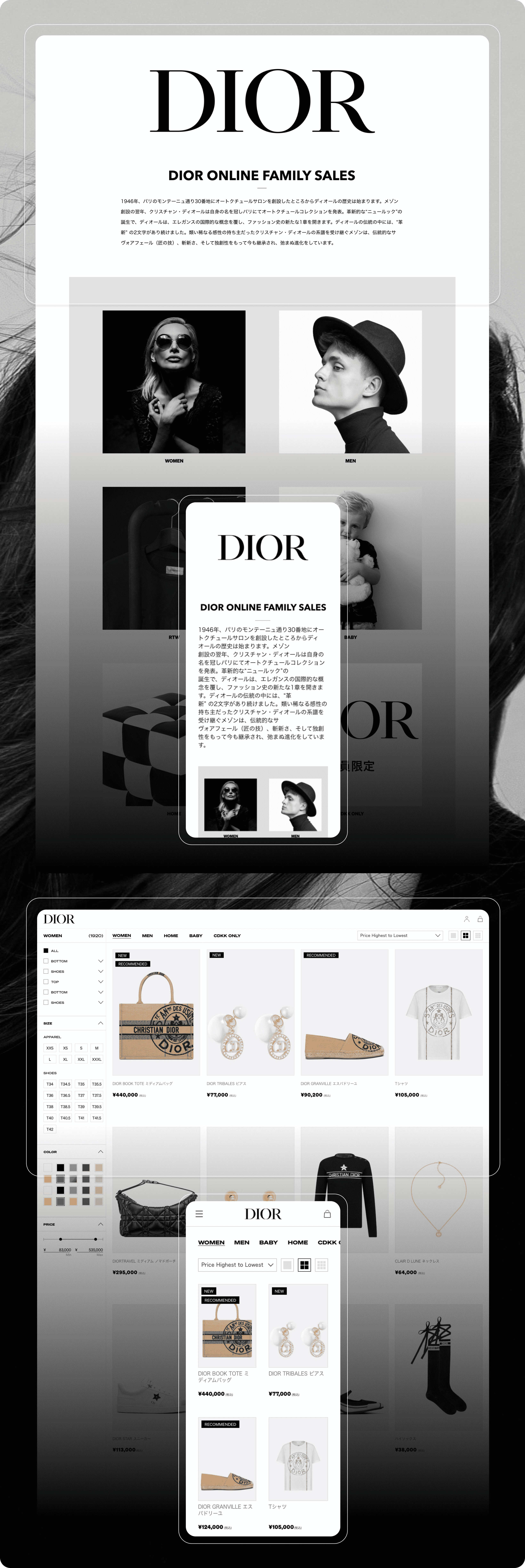
Landing Page
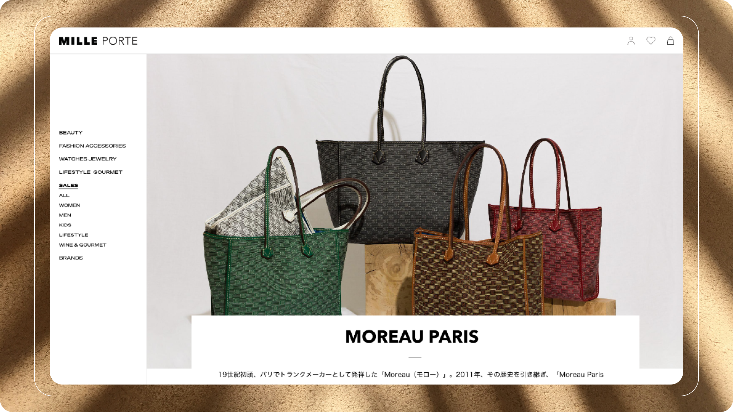
To address introducing high-end brands to our new website, we have strategically organized our landing page to distinctly categorize sales, with smaller vendors featured in one section and high-end offerings clearly labeled in categories such as beauty, luxury living, gourmet, and more.
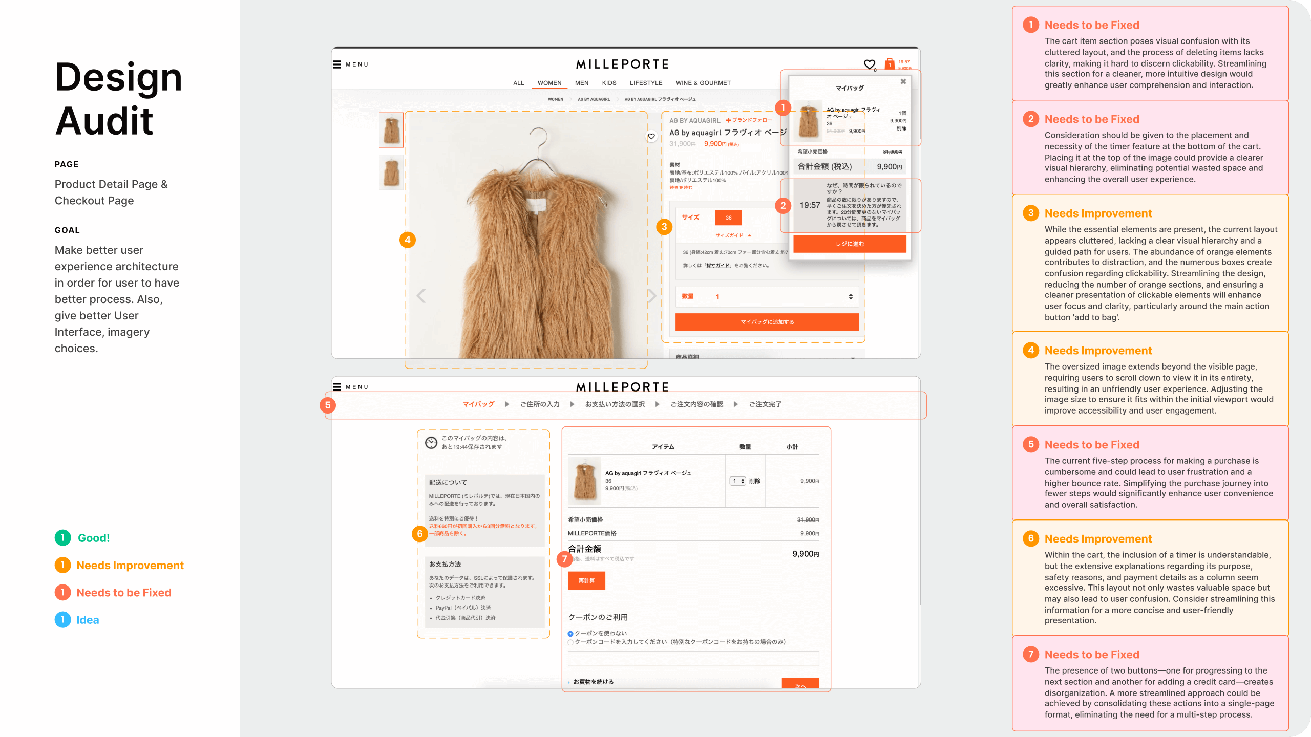
Cart, Product Listing, Product Detail, Checkout Pages
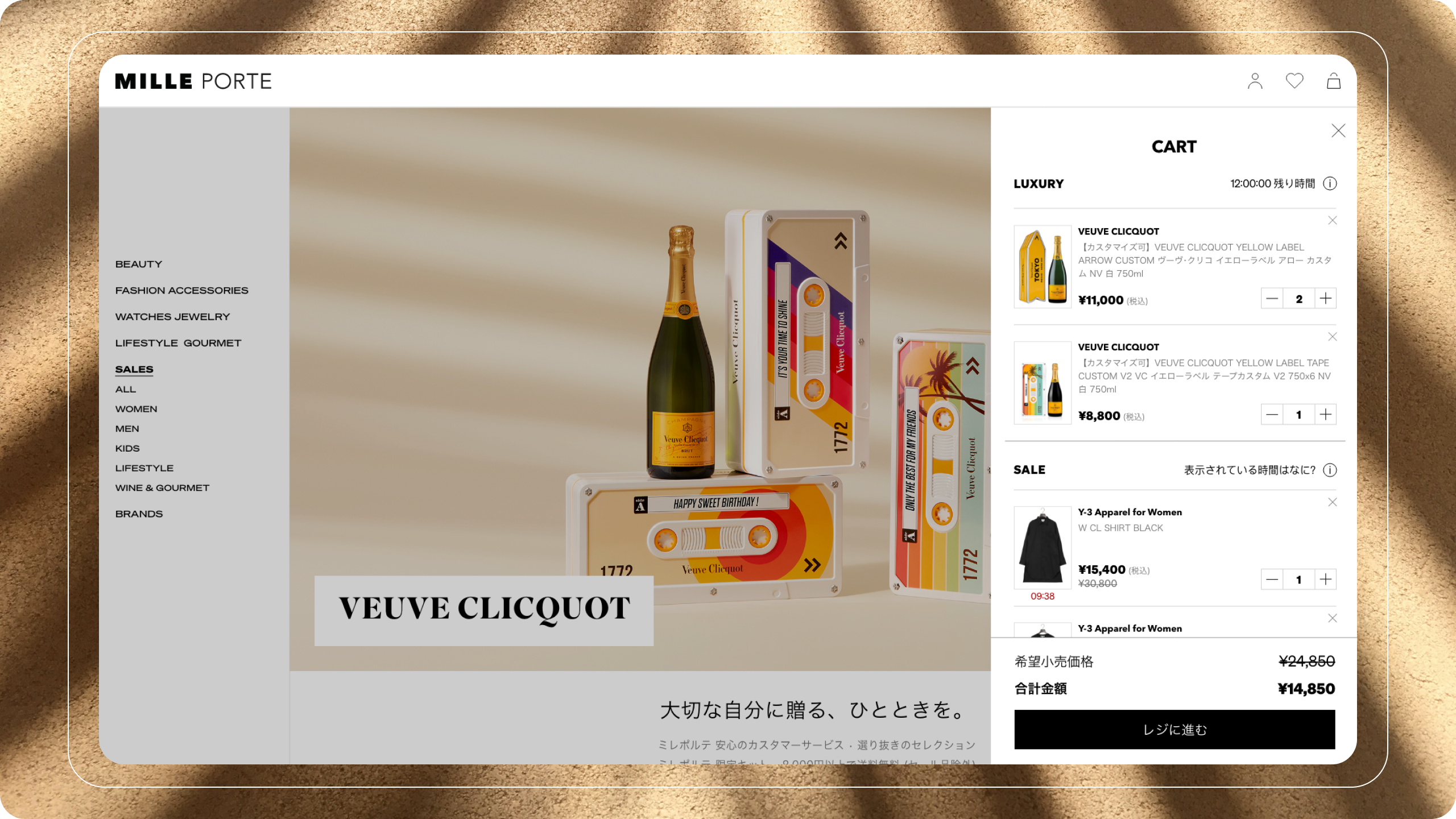
Cart: We curated and distinguished the luxury and sales sections to accommodate varying timer settings, ensuring a seamless shopping journey for our diverse clientele.
Product Listing: Our approach places a premium on brand storytelling by integrating it with product images. This integration fosters a deeper connection between our users and the brands they explore on our platform.
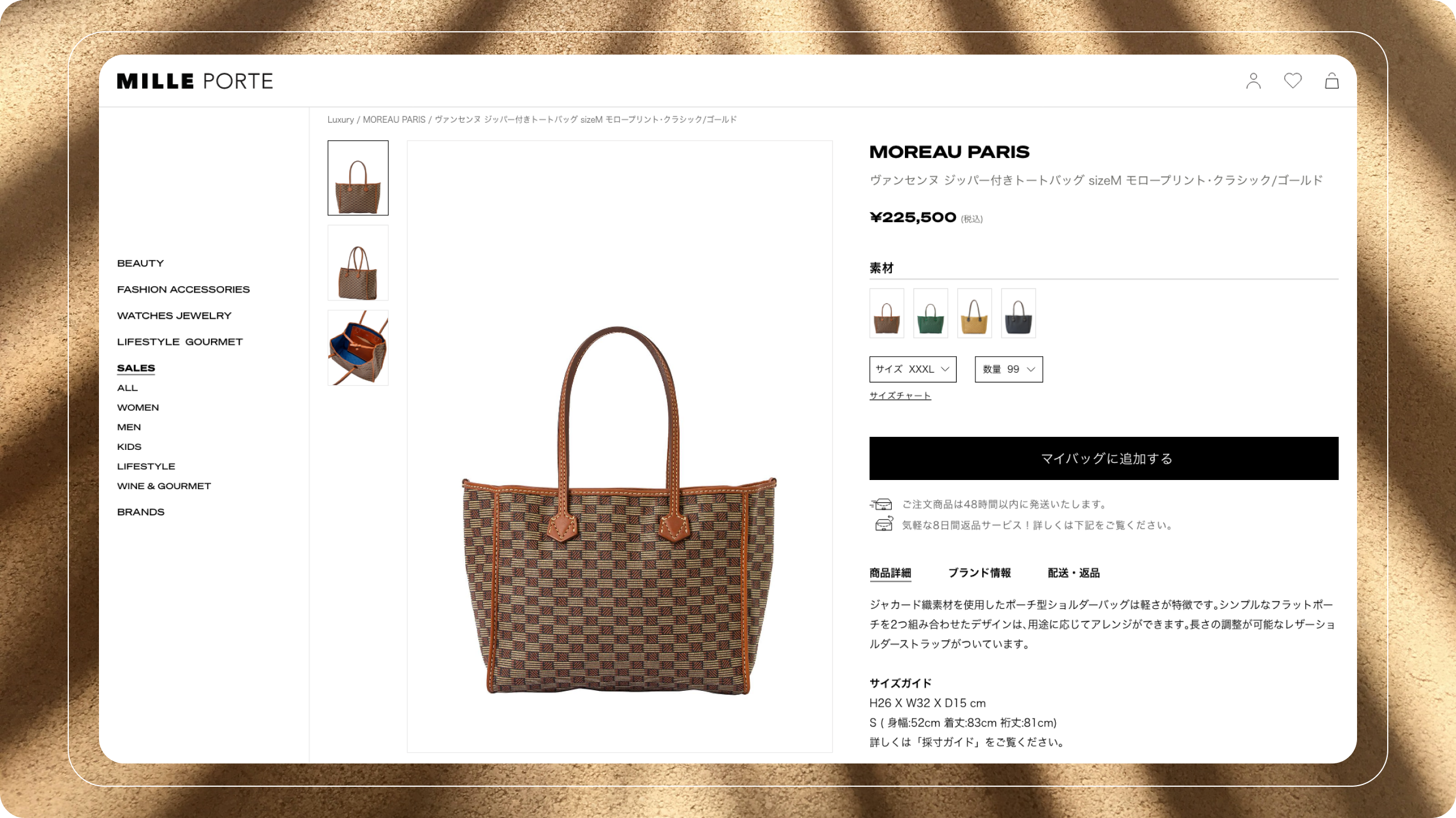
Product Detail: Instead of confusing our users with an array of individual features, we've prioritized the 'add to cart' button as the central element of focus. This streamlined approach is designed to simplify the decision-making process and expedite purchases.
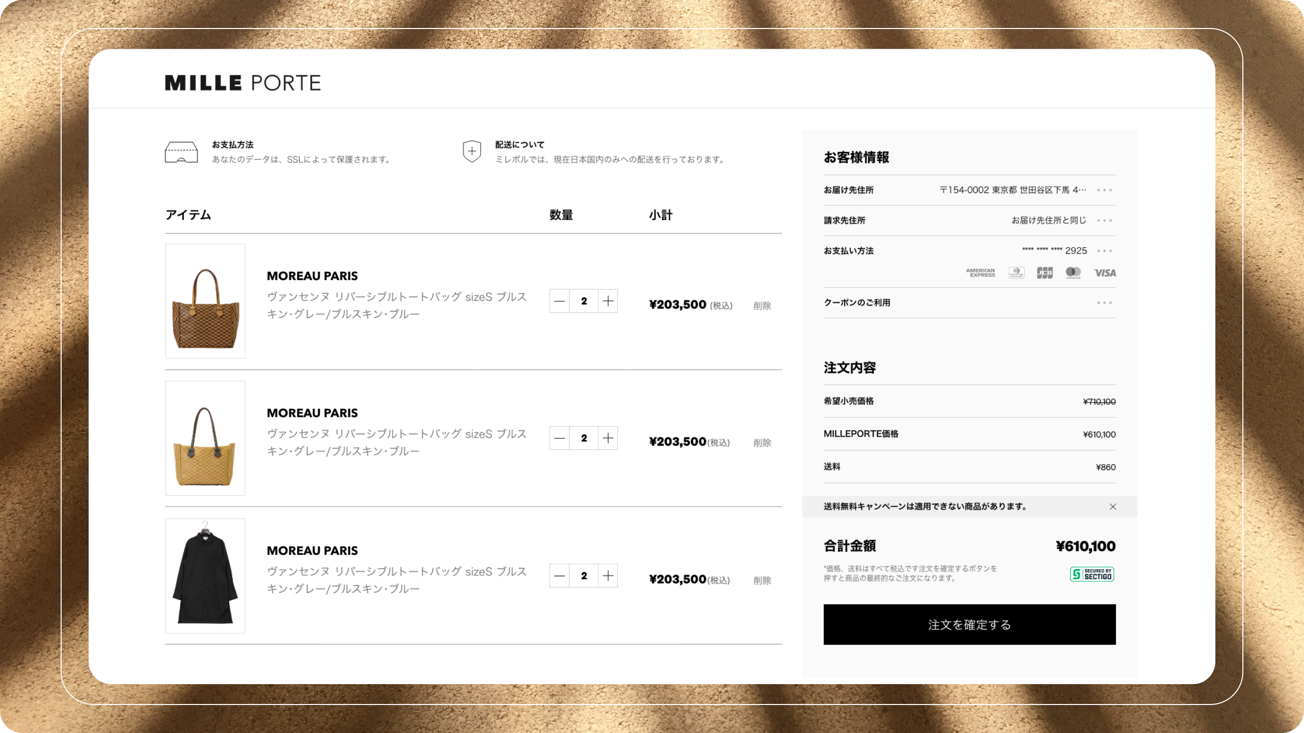
Check Out: To optimize the checkout process, we've condensed it into a single-page format. Additionally, we've refined the layout to feature pertinent information and options on the right-hand section, delivering a more intuitive and efficient user journey."
Family Sales
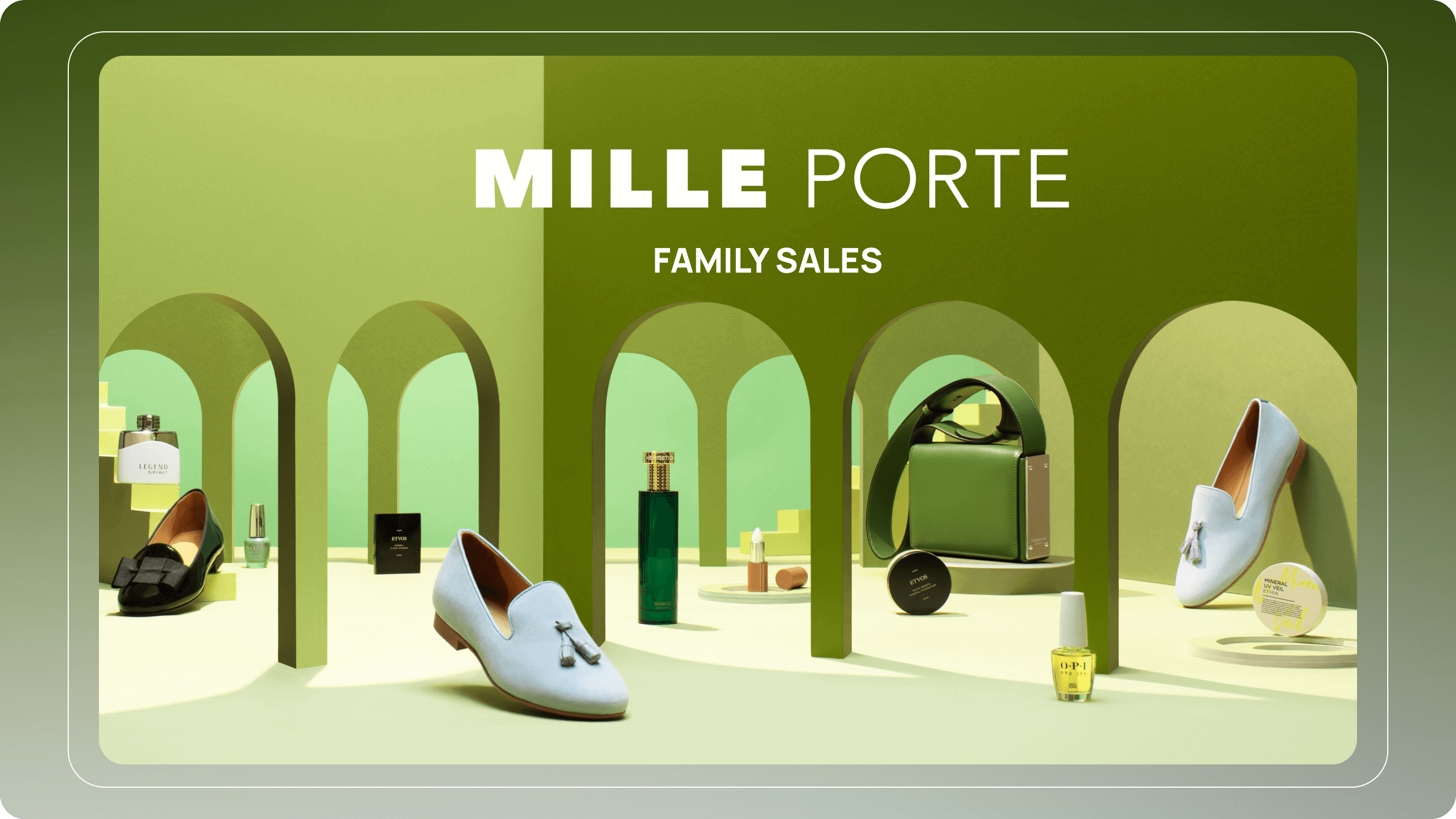
We addressed inventory challenges for esteemed brands, including Chanel, Dior, Marc Jacobs, L'Oréal, Veuve Clicquot, and Aesop, by implementing exclusive family sales accessible to VIP customers, employees, and an invitation-only customer base.
The Solution, Results and Success
The Solution
Overall, by redesigning the responsive website by adding luxury brand, and family sales, we were able to make it simple, convenient, and transparent resulting in a better experience for users and highlighting vendors.
Product Results and Success
An intuitive and visually appealing user experience responsive website resulting in a 175% increase in mobile user engagement and an 85% increase in web users.
Takeaway & What I learned
Takeaway:
My experience at a Series B startup in the e-commerce sector has provided me with invaluable insights into the dynamic world of digital retail. The key takeaway from this journey is the art of agility. In the fast-paced, resource-constrained environment of a Series B startup, adaptability, quick decision-making, and the ability to pivot are paramount. It's a realm where calculated risks and strategic resource allocation can make all the difference in achieving sustainable growth.
What I learned
Agility and Flexibility: Working in a Series B startup taught me the value of agility. Rapidly evolving market conditions demand the ability to pivot and adapt, often on short notice. This flexibility has become a cornerstone of my approach to problem-solving.
Customer-Centric Focus: In the competitive e-commerce landscape, prioritizing a customer-centric approach is paramount. I learned the art of listening to customer feedback, understanding their needs, and incorporating these insights into product development and marketing strategies.
Cross-Functional Collaboration: The collaborative nature of startup culture fostered an appreciation for cross-functional collaboration. I discovered the significance of working closely with various teams, from marketing to development, to ensure alignment toward a common vision and objectives.
Moving Forward
iOS App for MillePorte
iOS app was crucial for enhancing customer engagement, providing a seamless shopping experience, and staying competitive in the modern e-commerce landscape. It enables you to reach a wider audience, build brand loyalty, and leverage the unique features of mobile devices to drive sales and growth.
Selected Works
RoovookProduct Design
hidozoProduct Design
MilleporteProduct Design
Milleporte iOS AppProduct Design
Ji Kim
Product Designer
© 2023
