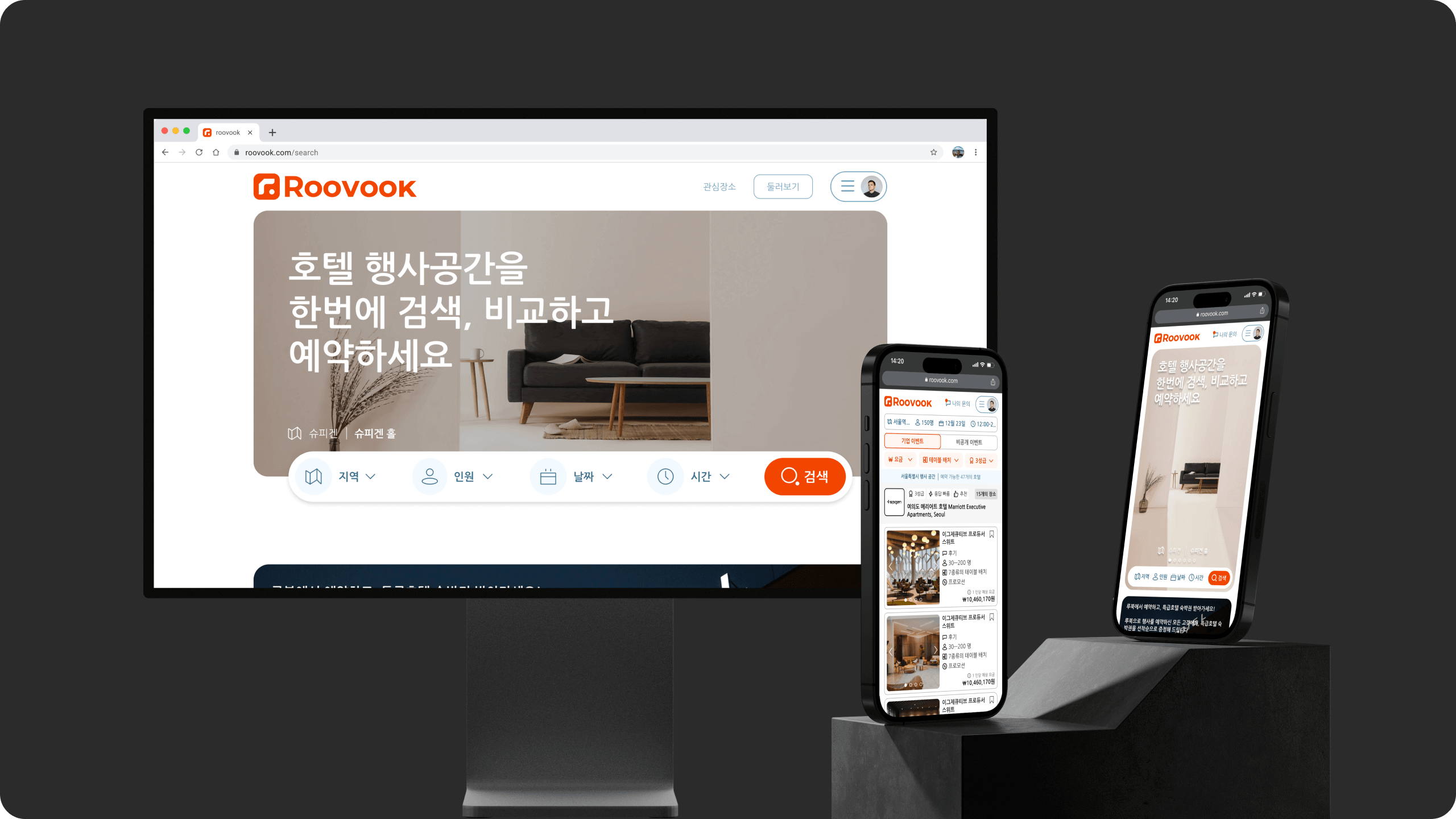
Roovook
Effortlessly browse and book your ideal event space
2022-2023
Overview
I had the privilege of joining Roovook as the sole product designer. Playing a crucial role in transforming the company's brand identity, I led the efforts to craft an end-to-end user experience and interface design that set us apart. Collaborating closely with the founders, I focused on creating a platform that seamlessly connects customers and companies searching for event spaces in Korea.
Role
Product Designer
Responsibilities
Product Design
Product Strategy
Branding
Team
Kyle Kim, CEO
Byron Kim, CFO
Michael Jung, Engineer
Narrative
Picture yourself as a busy professional juggling numerous tasks. Now, add the pressure of finding the perfect venue for your company's upcoming event. Calling different hotels becomes a time-consuming maze as you navigate through food options, seating arrangements, and event requirements. And even after settling on a venue, you still need to seek approval from upper management. On top of that, unexpected change requests keep popping up.
Problem, Key Question and Goal
The Problem
• The current existing solution fails to have the right search results and a lack of comprehensive information makes it difficult for users to find the right venues efficiently.
• Companies were looking at the listings from Roovook and directly calling the hotels, which resulted in bypassing and losing potential revenue.
• UI of the whole website was outdated.
Key question
How might we redesign booking company event experience for HR teams so that it is more clear and efficient?
Goal
• Improve end-to-end user experience and interface, making it more efficient and intuitive for the user.
• Modernize the User Interface anchored on new branding.
• Metrics to keep an eye on: UX main flow pages (Landing → Search → Detail → In Process)
Strategy & Kick Off
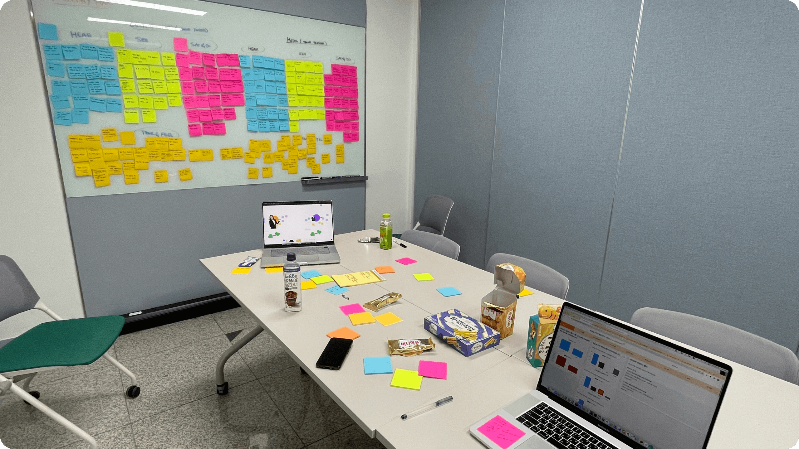
Workshop
During the very first week of working with Roovook, I led a two-day workshop in order for me to fully understand the company and business problems through interviewing the founders. This allowed me to digest the problems and let ideas marinate.
The Process
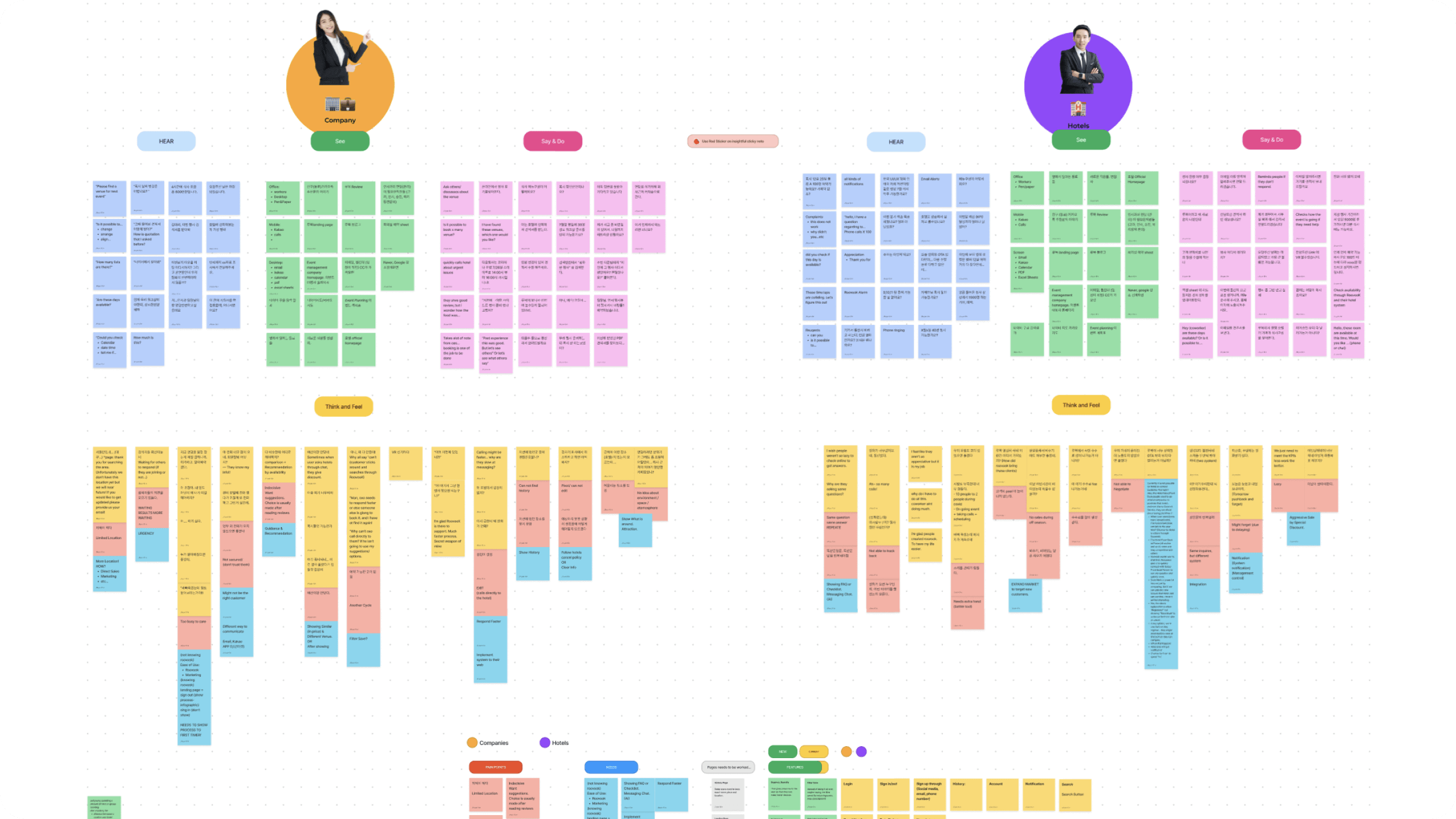
Usability Testing
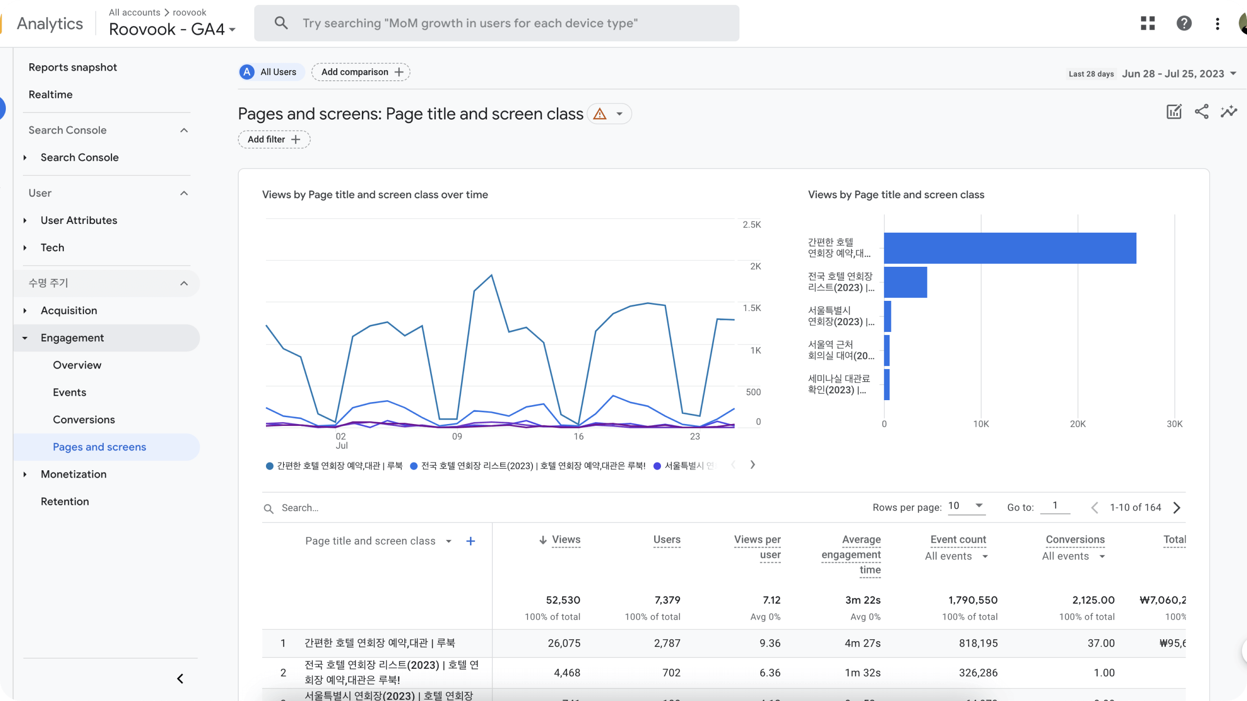
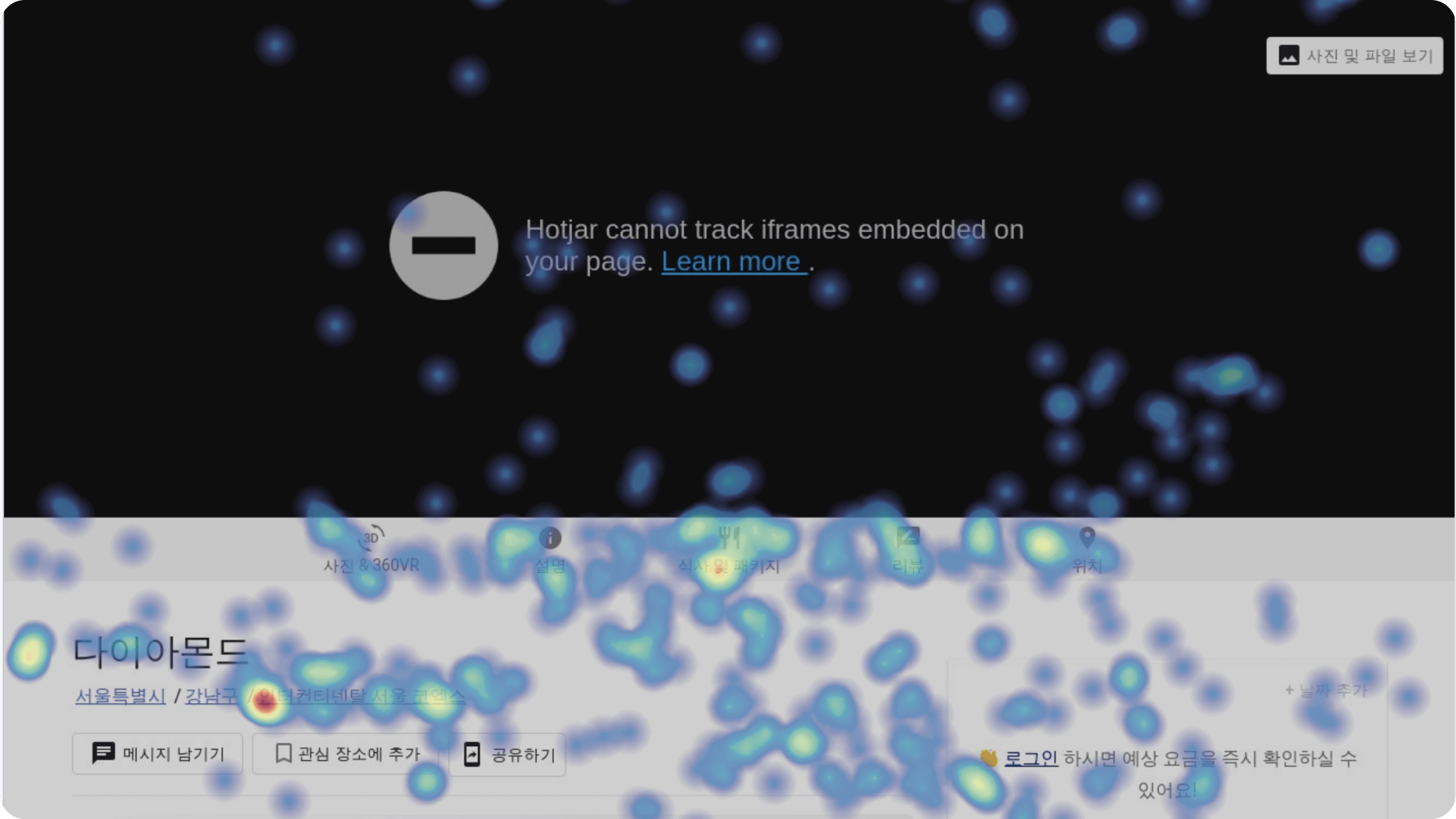
To understand the user's experience, I used tools like empathy mapping, MoSCoW charting, and persona development, affinity mapping to gain a holistic view of the pain points. Getting insights from Hotjar and Google Analytics to see the user journey, examining how venue finder and venue provider (hotels) interacted within the platform.
Summary:
• Evaluated user interactions with the website by observing real users during specific tasks.
• Observed users frequently going back and forth or opening multiple tabs to find information, highlighting structural issues.
• Carefully note the reasons for the placement of elements and text before reorganizing the information.
• Promptly discussed issues with the team after critiquing user performance on the current website. Made quick changes based on user feedback, resulting in noticeable improvements.
All this led to ideating and formulating potential features that would effectively address the identified pain points and drive meaningful improvements to the platform.
Gathering Insights
• Users consistently struggle with the booking process due to a complex and fragmented user experience.
• Users highly value detailed and visually appealing event space descriptions, such as reviews, high-quality images, and comprehensive amenities information.
• Offering too much detail can give users the power to negotiate with hotels outside companies' service, leading to potential bypassing issues.
• The absence of a seamless communication channel between venue finders and providers hinders efficient coordination.
Prioritization
After laying out the comprehensive research and insights, we gained a holistic view of the prioritization needs at Roovook. We realized that we needed to change both Roovook and EMS (event space management) for hotels but by prioritizing them, we were able to see our key metric. First, we focused on redesigning the website to be responsible with new experience so that we can give current user better experience. Secondly, we rebranded the company to be distinguished and memorable to attract new users. In doing so, we will gain more different hotels and will result in growing revenue for Roovook.
Identity System & Design System
Identity System
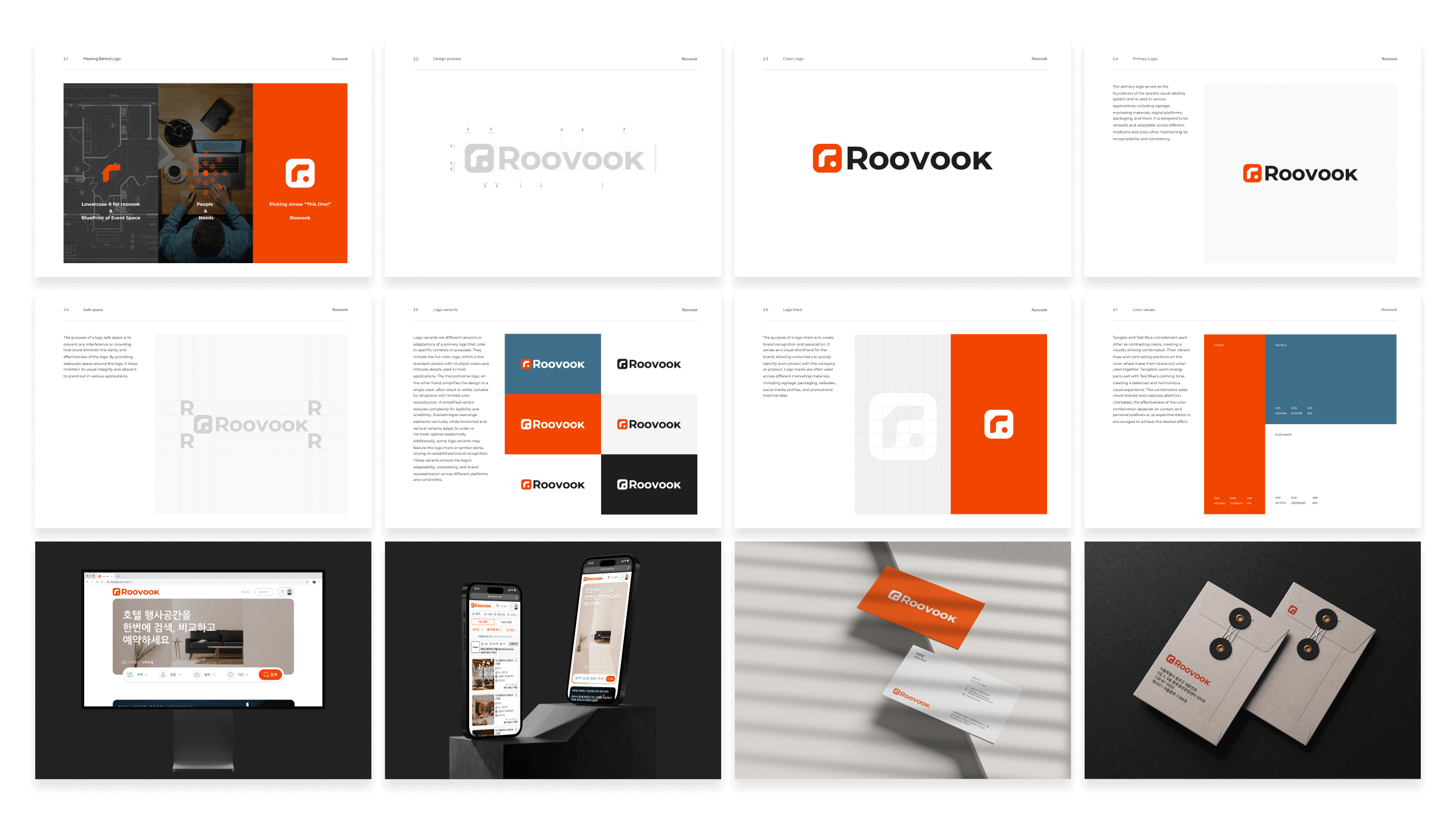
In the process of rebranding Roovook, I treated the company as a person, seeking to understand its essence through the founder's explanation of the name's meaning: "room," "venue," and "booking." Defining Roovook's personality with attributes like Effective, Cooperative, Functional, Satisfied, Reliable, Productive, and Secure, I embarked on style scaping to visualize how the brand would look and feel. This iterative process ensured that every design element resonated with Roovook's character. The logo design was a significant endeavor, blending the lowercase "r" inspired by architectural blueprints, a bold dot representing a statement, and a circular shape symbolizing people and their needs, forming an arrow-like design, representing Roovook's direction.
Design System
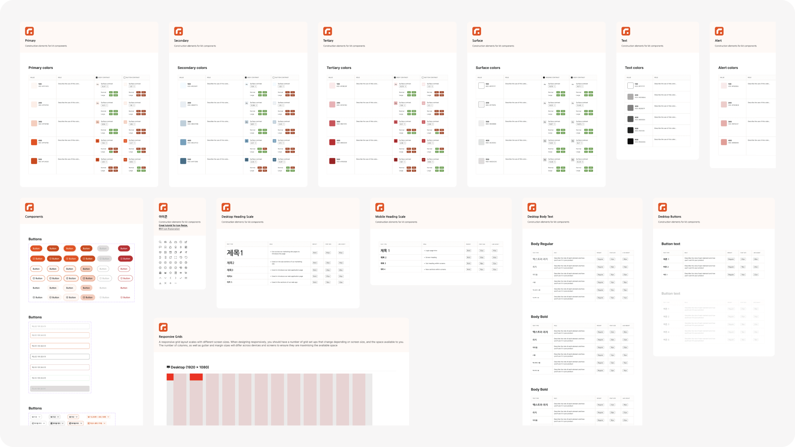
The logo became the anchor for the entire design system and brand guidelines, including typography, color palettes, and iconography. These guidelines provided a cohesive visual language for the product, ensuring a consistent and recognizable brand identity. By designing the product in line with the brand guidelines, Roovook emerged as a reliable, user-centered platform that embodied its new identity, giving a strong connection with its audience.
Design Before and After
Landing Page
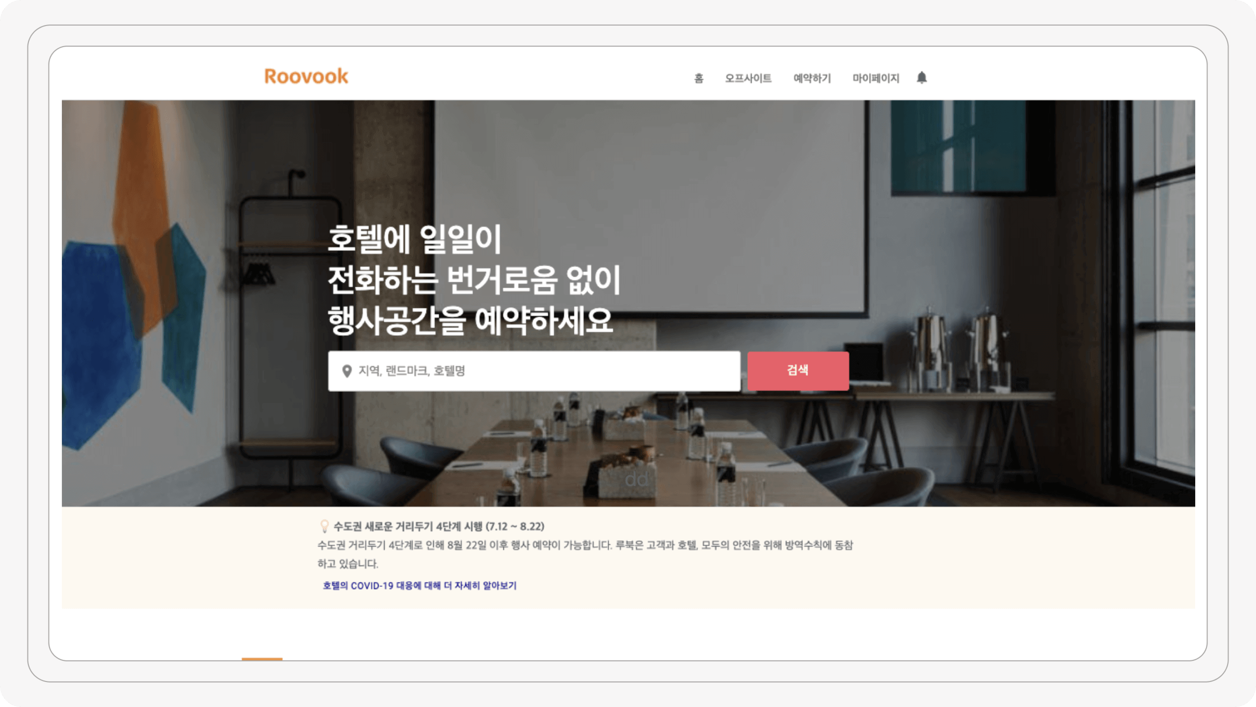
Before:
In the old landing page, the search bar was limited in searching by location or hotel name. Also, the navigation bar had more options than needed. Users were limited in finding and distracted from finishing their main task.
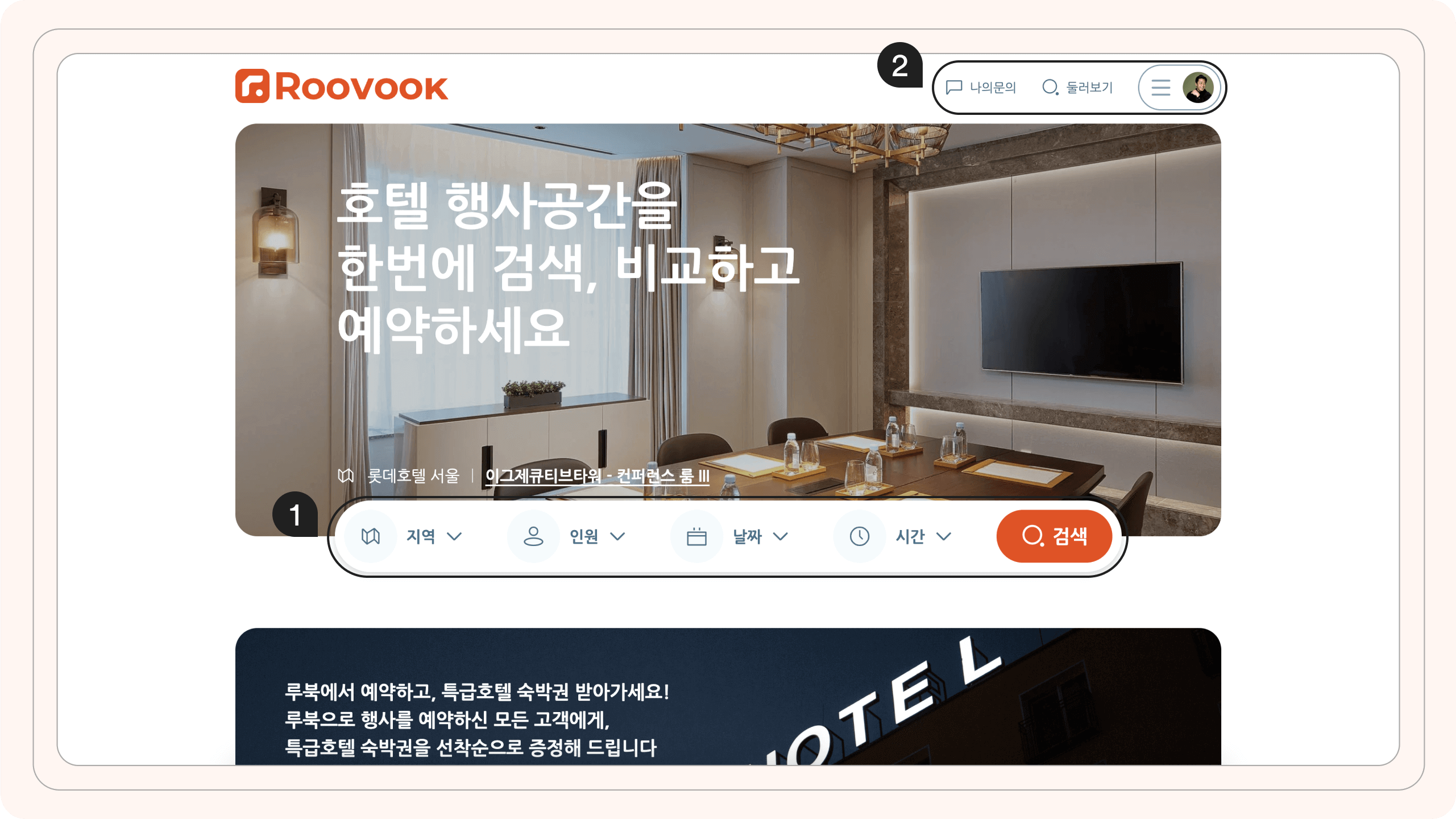
After:
1. I simplified the navigation bar by hiding unnecessary elements, emphasizing two vital pages: the process page and “explore”(search page) after realizing that users are in two stages, either they were searching for venue or they are in process of finalizing their inquiries.
2. I also decided to create more detailed search functionality where it allowed users to obtain more accurate and focused results tailored to their specific need.
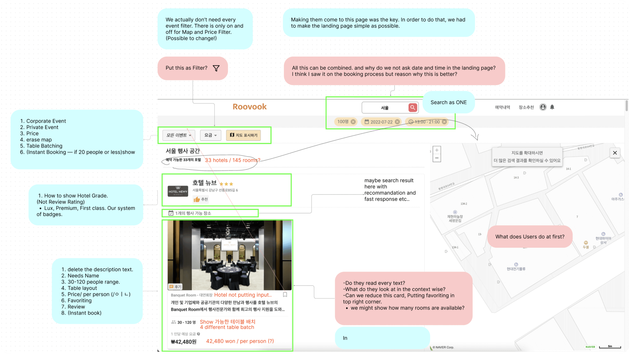
Search Page
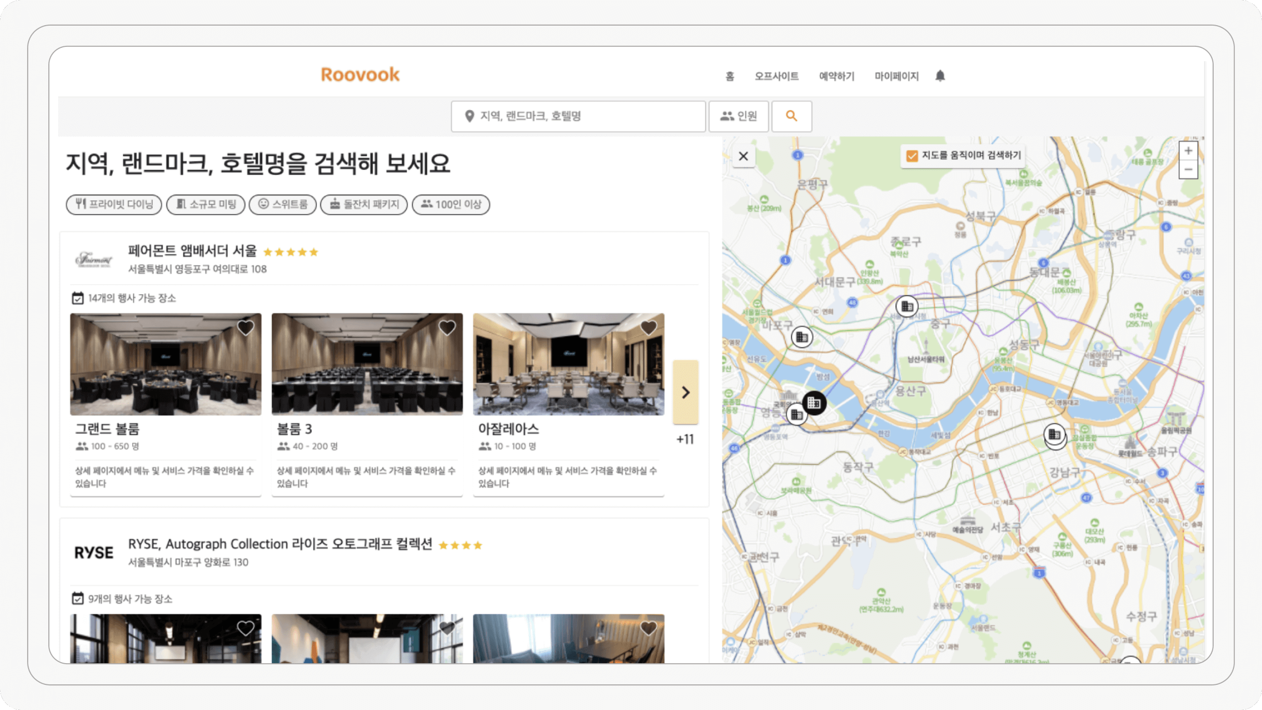
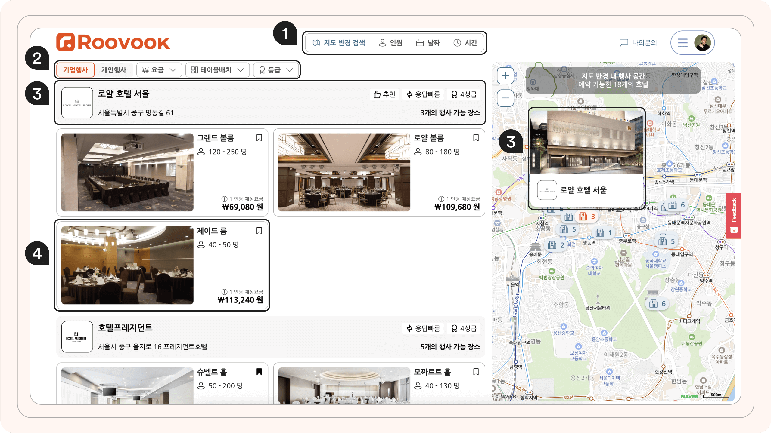
Before:
In the old search page, there was a two-state button where they were able to look for specific events. I saw that no one was actually clicking on the buttons in the heat map. Users were frustrated by the limited venue information and venue view of each hotel which resulted in opening many tabs in order to compare them.
After:
I needed to reduce users from opening many tabs by allowing users to see previous input and also some key information from the detail page. By being more transparent and accurate in search, we were able to reduce users opening many tabs.
The four main areas I focused on:
1. Navigation: Allowing users to see and change their previous search, so that they are allowed to make changes and quickly see different results from their input.
2. Filter: By creating one toggle switch for company events or personal events, we were able to reduce users asking hotels if personal events such as birthdays, weddings, and workshops, were possible. I also decided to have an option for filters for price range, table batch, and ranking in order for users to find the right venue tailored to their needs.
3. Listing of hotel and map: To facilitate informed decision-making, we designed the hotel listing to showcase important details such as logos, names, rankings, and positive attributes like a fast response, recommendations, and good reviews. Also, a quick glance at the exterior of the hotel gave a sense of the hotel’s ambiance and aesthetic. By presenting all these elements in the listing, users could easily evaluate hotels and make well-informed decisions, saving time and ensuring a successful event experience.
4. Venue Card: The venue card was designed to provide users with essential information at a glance. It prominently displays the capacity of the space, the number of table batches available, any ongoing promotions, and the average price per person. This enhanced visibility and transparency resulted in a reduced tab opening, as users could quickly assess whether a particular option met their requirements.
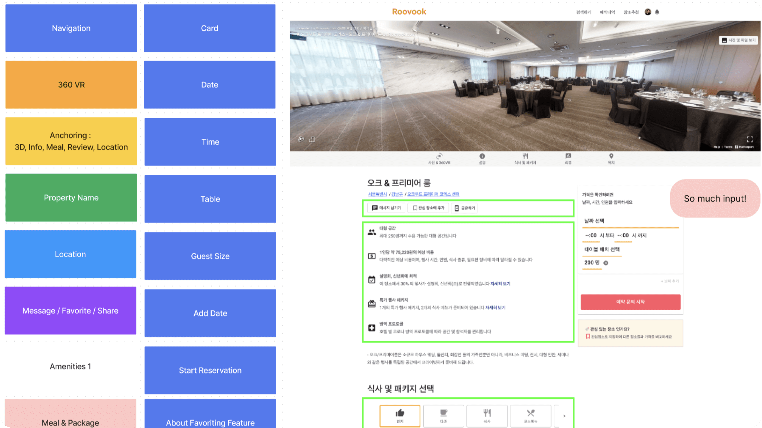
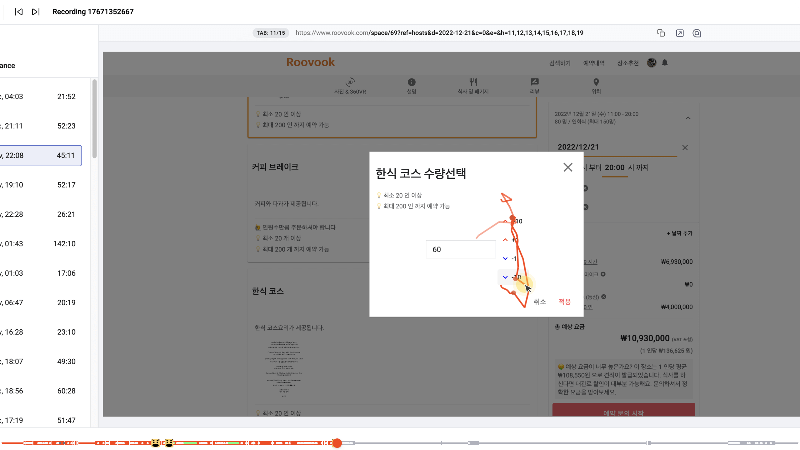
Detail Page
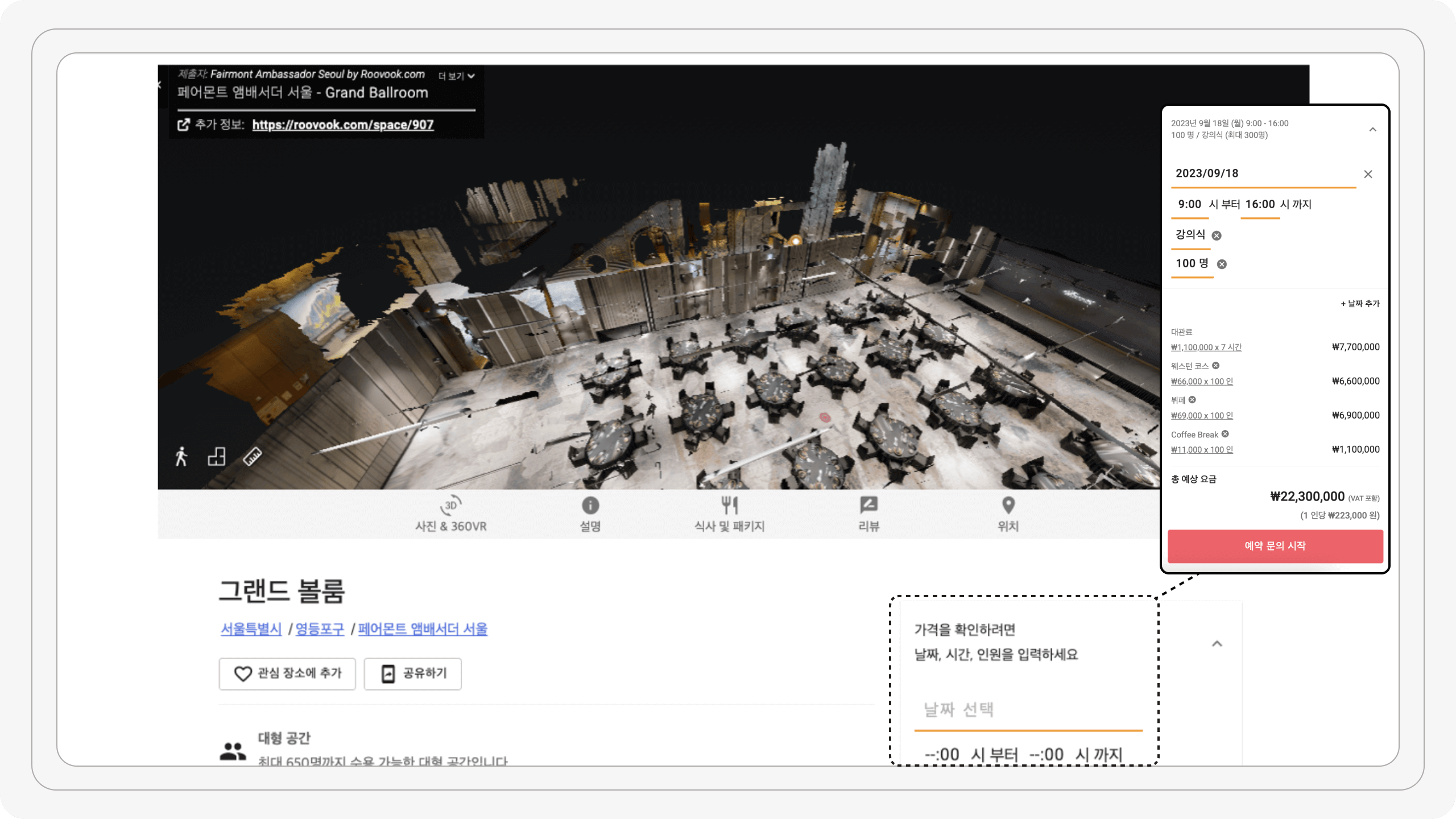
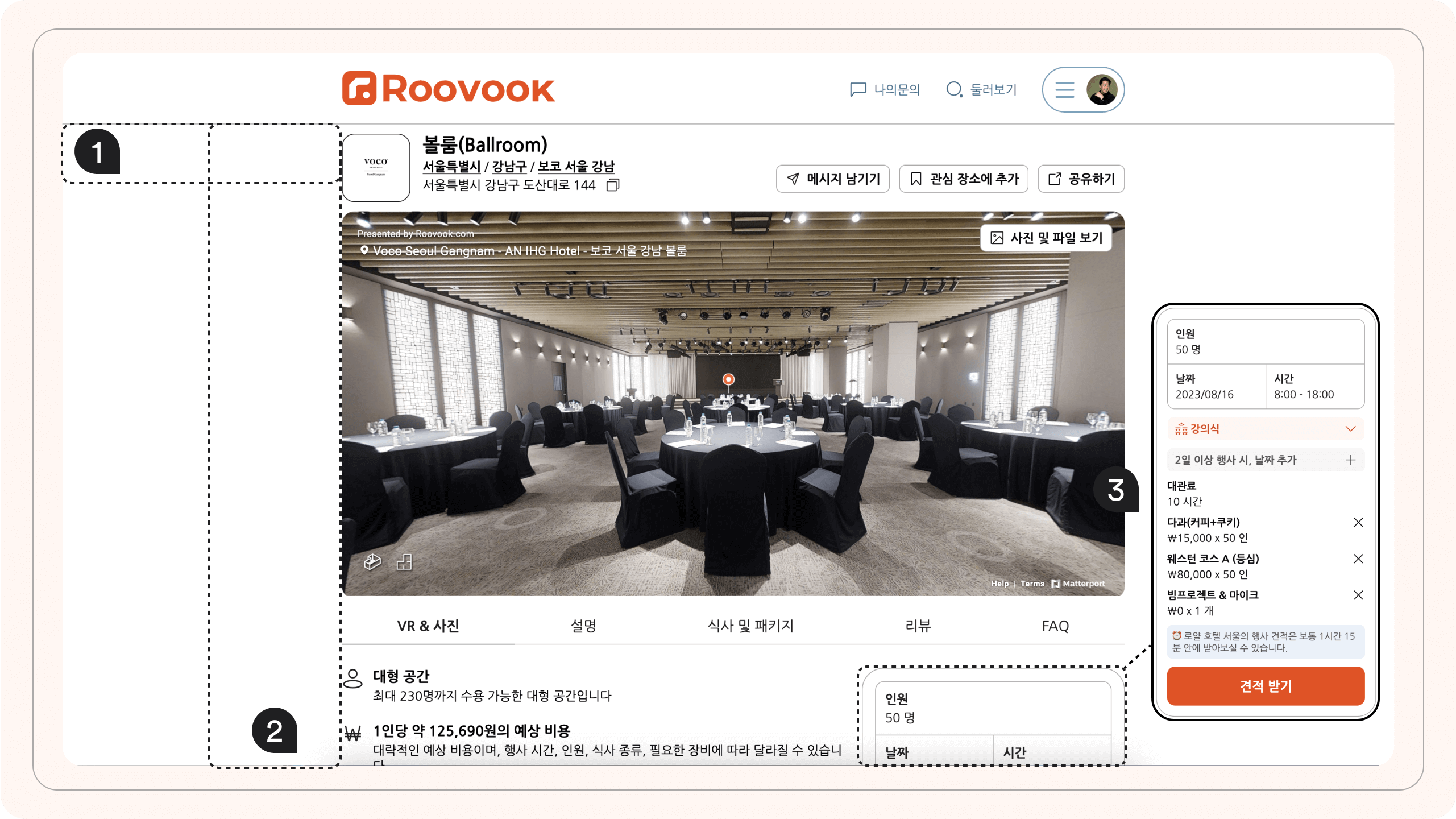
Before:
In the old detail page, the information about the venue was lengthy making time consuming for users to digest all the information. Also, it was unorganized that, users were struggling to find the information, or even worse they were asking the hotels or the Roovook directly. Sometimes users were seeing the price and directly calling hotels for the same quote which caused the bypassing issue.
After:
1. I reduced the page width to give a focus point.
2. I used the information architecture (IA) principle to create a logical and easily accessible detail page resulting reduced and organized page by 35-45% to enhance efficiency in user evaluation for multiple venues.
3. By hiding the detailed price, users were encouraged to submit an inquiry resolving the bypassing issue.
Process Page
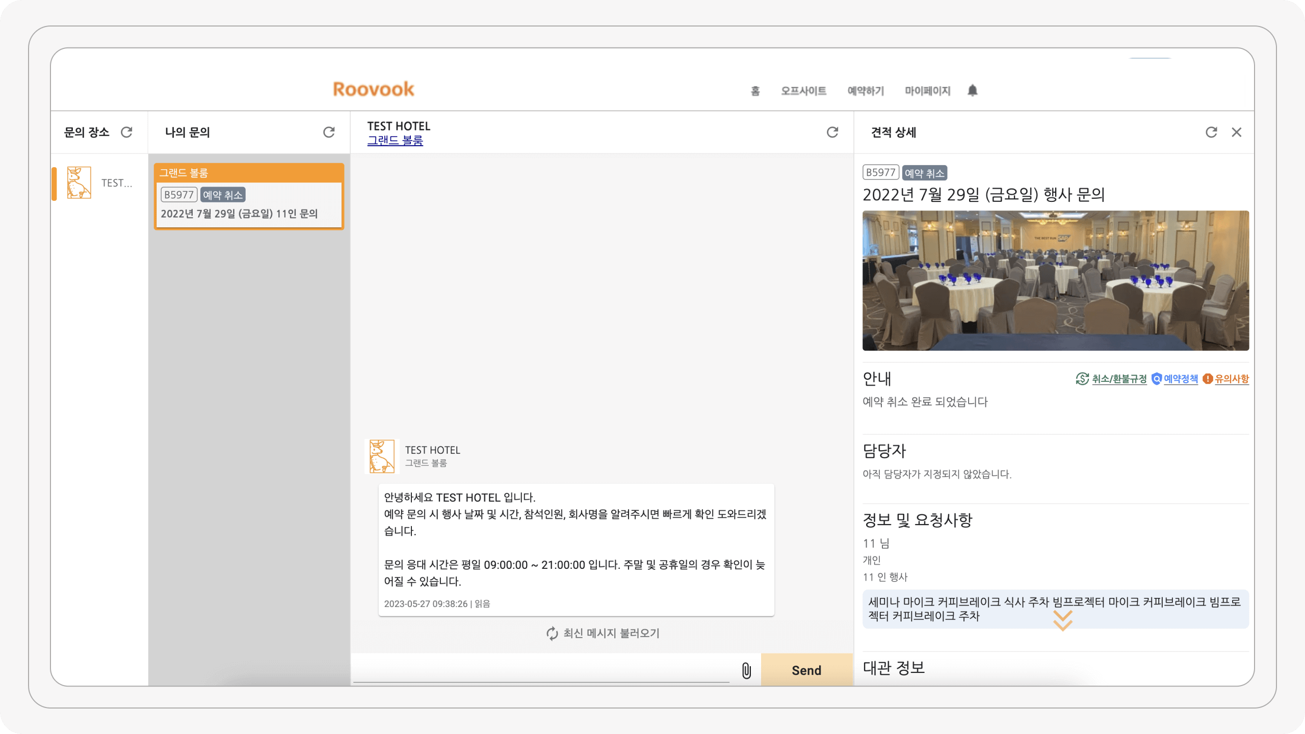
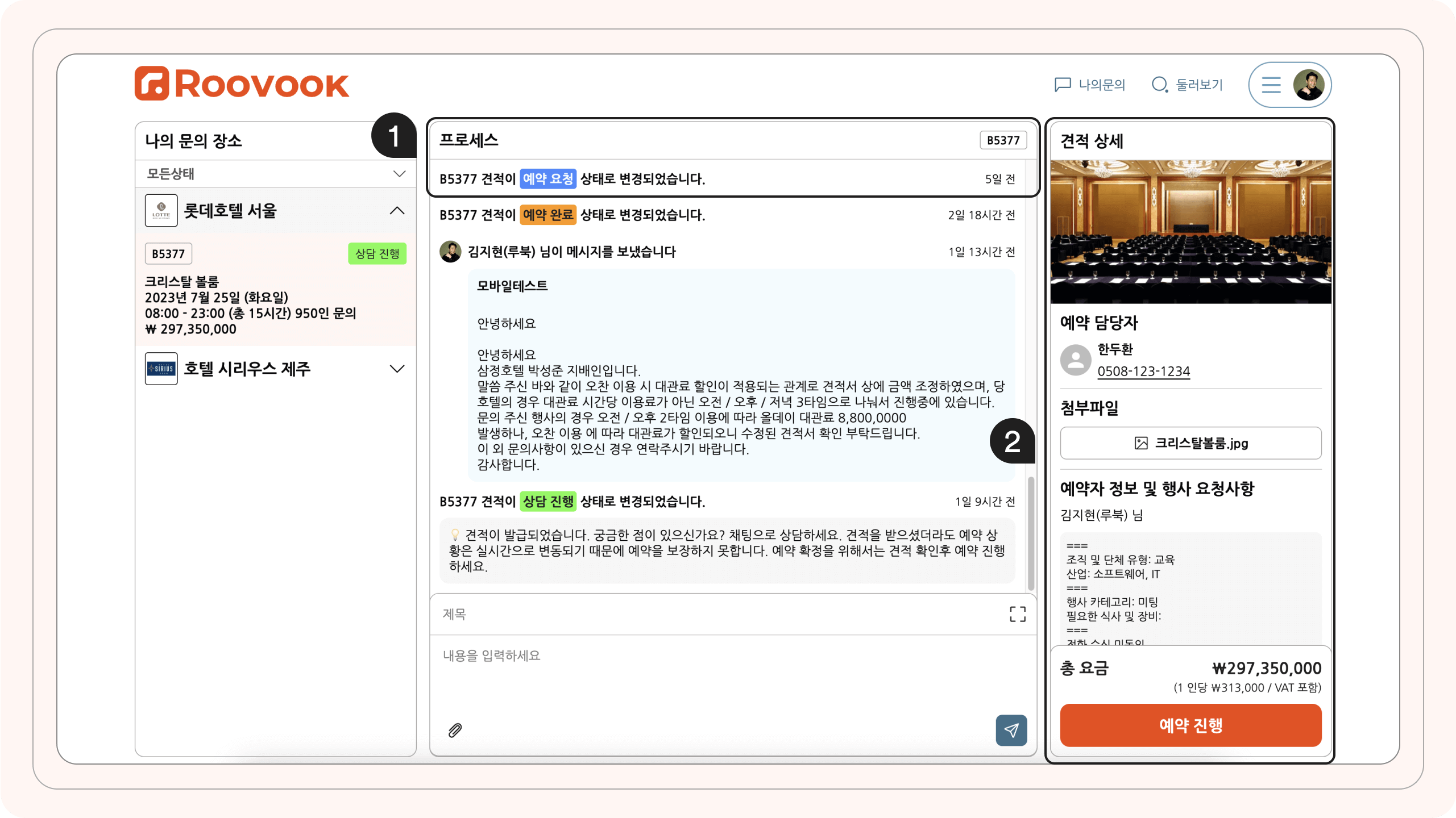
Before:
Users were frustrated when hotels didn’t respond quickly since they were confused by the page looking like a messenger page. This caused users to exit the page, looking for different hotels, or even trying to call them by finding them on the internet.
After:
1. By incorporating a clear headline that indicated which stage the users were currently on, providing them with a sense of context and guidance, it helped users understand their progress and provided guidance throughout the process.
2. Additionally, to ensure a seamless user experience, we made taking action easy and accessible. When users were ready to proceed, a prominent "proceed" button would pop up at a sticky pricing section, eliminating the need for users to search for it.
The Solution, Results and Success
The Solution
I redesigned the responsive website to optimize the user flow and accurately assist users in finding the right venues.
Product Results and Success
We have successfully launched the user main flow (Landing → Search → Detail → In Process), and we were able to make it more accessible, clear, and efficient for users resulting in a better user experience.
1. After two weeks of results, the number of searches increased by 10X (1000%) on both desktop and mobile platforms by improving the search experience and usability. This indicates that customers are now conducting more searches with various queries, suggesting an improved overall search experience.
2. We successfully encouraged users to submit inquiries with ease, resulting in a remarkable 200% increase in inquiry submissions.
3. The positive impact of the new version on customer engagement was observed on both desktop and mobile platforms.
Takeaway & What I learned
Next time I will...
I have experienced tremendous personal growth over the past year while working as the sole designer at Roovook. It has been a blessing to have the opportunity to work at a startup company and lead projects. Here are some valuable lessons I have learned:
Focusing on business outcomes: While user experience and aesthetic design is important, I have come to understand that the ultimate measure of success lies in how it contributes to the business. It's important to ensure that the design aligns with the metrics and goals of the company. If the design doesn't positively impact the metric system or deliver tangible value, then all the time and energy spent on it would be wasted.
Communication with the Team: It’s essential to collaborate early and often, providing context and scope to ensure alignment. Strive for a balance between effort and impact, focusing on high-impact activities that contribute to project goals. Foster an environment of open communication where team members feel comfortable sharing their opinions and concerns. Encourage transparency and authenticity to build trust and strengthen team dynamics. By implementing these strategies, you can enhance collaboration, make informed decisions, and achieve collective success.
Embracing an iterative design process: Before creating a fully polished product, I have learned the importance of testing the waters first. Just like testing a skateboard before building a car, I have embraced an iterative design process. This approach involves gathering continuous feedback, iterating on designs, and refining the user experience. By prioritizing user feedback, I can create more user-centered and effective final products.
Leveraging design systems: I initially handled all aspects of design myself, but I now recognize the importance of leveraging existing design systems to streamline my workflow, quickly test designs with users, and assess their impact, allowing for iterative improvements and a more efficient and user-centered design process.
Seeking feedback from other designers: Being the only designer in the team, I have found it immensely helpful to seek feedback and critique from my colleagues and the design community. Their insights and perspectives have broadened my horizons, allowing me to refine my skills and produce better designs.
By incorporating these lessons into my work, I am confident that I will continue to grow as a designer and create more impactful and successful products.
Moving Forward
EMS
While seeing how users engage with the product, we will start working on the Event Space Management(EMS). Current Roovook’s EMS tools are difficult for hotels to use and resulted in inconsistent listings across the platform. The challenge is to design a user-friendly dashboard for event space owners that make it easy to manage listings, respond to inquiries, and track bookings. When we improve EMS, we are confident that it will make user side better as well.
Selected Works
RoovookProduct Design
hidozoProduct Design
MilleporteProduct Design
Milleporte iOS AppProduct Design
Ji Kim
Product Designer
© 2023
