An eCommerce company based in Tokyo that modernizes the digital shopping outlet for over 4,000 brands.
November 1, 2019 — June 1, 2022
Overview
MillePorte received an investment of $27M from their main investors, Goldman Sachs, and Itochu, in 2019 for the Series B round. The company restructured the team and saw 30 people leaving the company as well as a new team of 20+ people joining the company between the end of November 2019 to mid of 2020. As a product designer, I had a crucial role in executing the responsive website, developing B2B family sales, and designing the iOS App.
Role
Product Designer
Responsibilities
Product Design
Product Strategy
Brand Experience
Team
Kyle Barrow, Product Manager
Olivier Bigarini, Creative Director Olivier Mayer, Lead Front End
Crisler Chee, IOS Engineer
Narrative
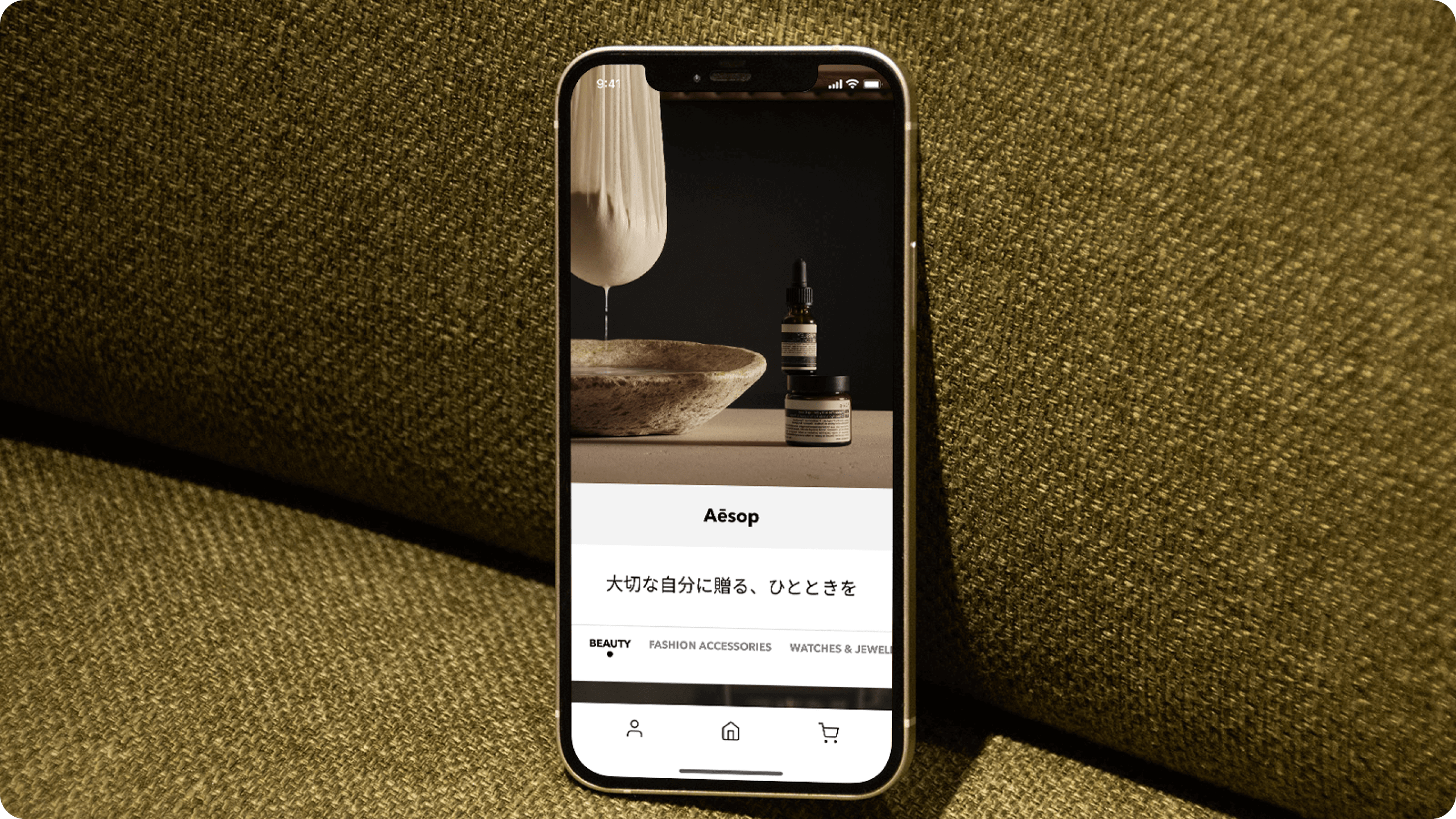
As we address ongoing challenges at MillePorte, the development of our iOS app remains pivotal. Recognizing the trend of customers making purchases during their commutes, the app is designed to enhance the shopping experience. Features such as push notifications, personalization, and seamless payment options not only will elevate user satisfaction but also foster brand loyalty. This strategic move significantly boosts our business sales and solidifies our presence in the e-commerce landscape.
To see the process visit MillePorte Case Study→
The Process
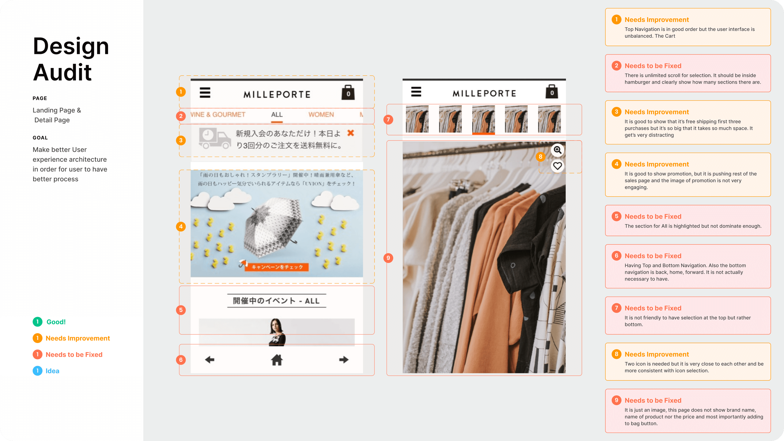
Design Audit
Conducting a comprehensive design audit for the e-commerce mobile view was essential to gain a deep understanding of its current user experience, identify pain points, and assess existing design elements. This strategic assessment served as the foundation for the subsequent redesign, ensuring that the improvements made were informed by a thorough analysis and aligned with the site's goals, ultimately enhancing usability, visual appeal, and overall user satisfaction.
Launch & Onboarding
Onboarding
Welcome: Ensures easy access for users who want to personalize their experience, access their profiles
Benefit: It serves as a gateway to discover our diverse product categories and collections, providing users with a seamless browsing experience.
Login/ Create Account: Quick access to view and manage shopping carts. This location minimizes any potential interference with the immersive viewing of fashion items while ensuring efficient access to the shopping journey."
Bottom Navigation
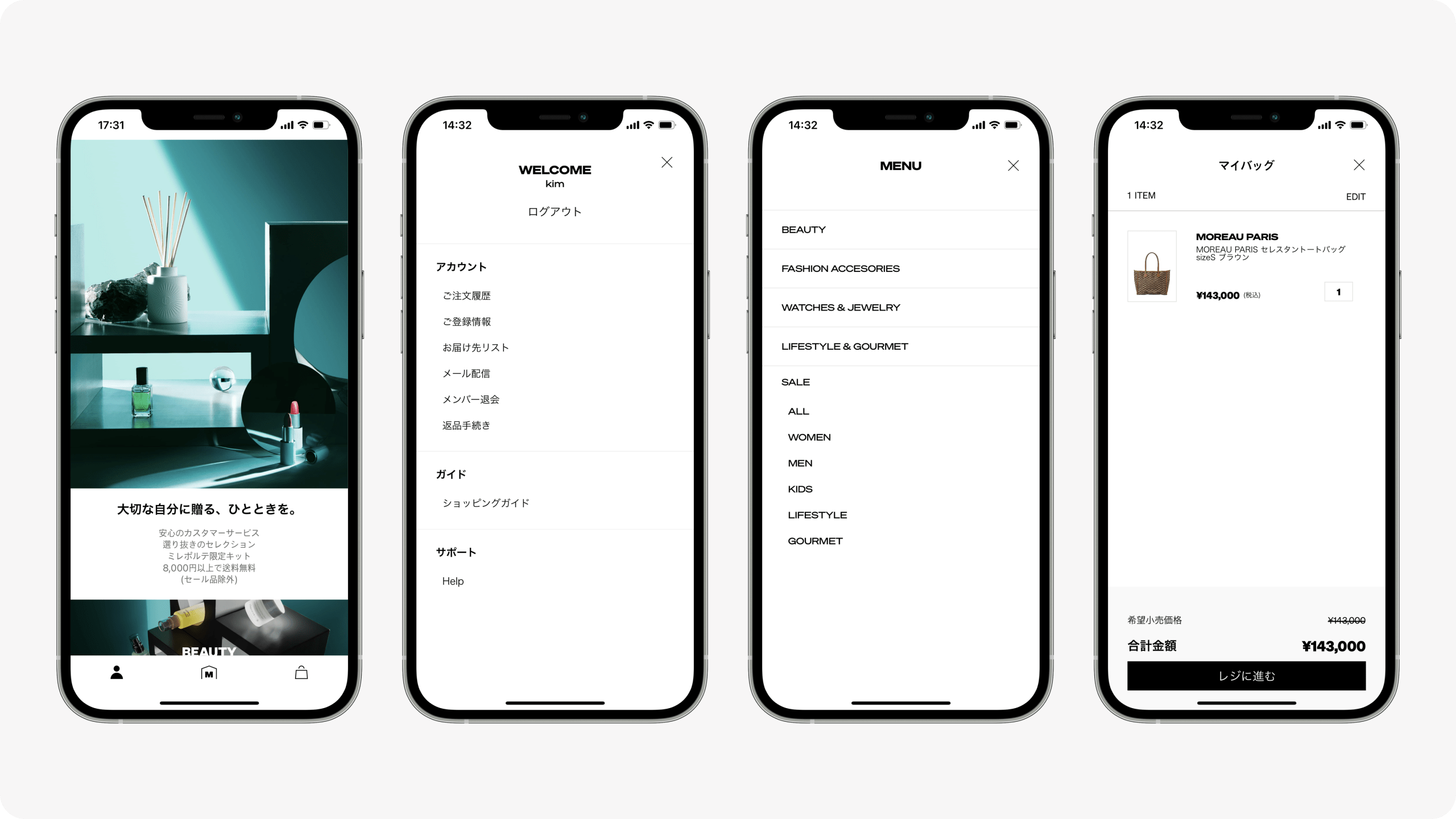
Navigation Placement
In the fashion industry, we prioritize providing users with an unobstructed view of high-quality visuals and products. To achieve this, we strategically positioned the navigation icons at the bottom to immerse users in captivating fashion images.
Account (Left): Ensures easy access for users who want to personalize their experience, access their profiles
Menu (Middle): It serves as a gateway to discover our diverse product categories and collections, providing users with a seamless browsing experience.
Cart (Right): Quick access to view and manage shopping carts. This location minimizes any potential interference with the immersive viewing of fashion items while ensuring efficient access to the shopping journey."
Main Flow
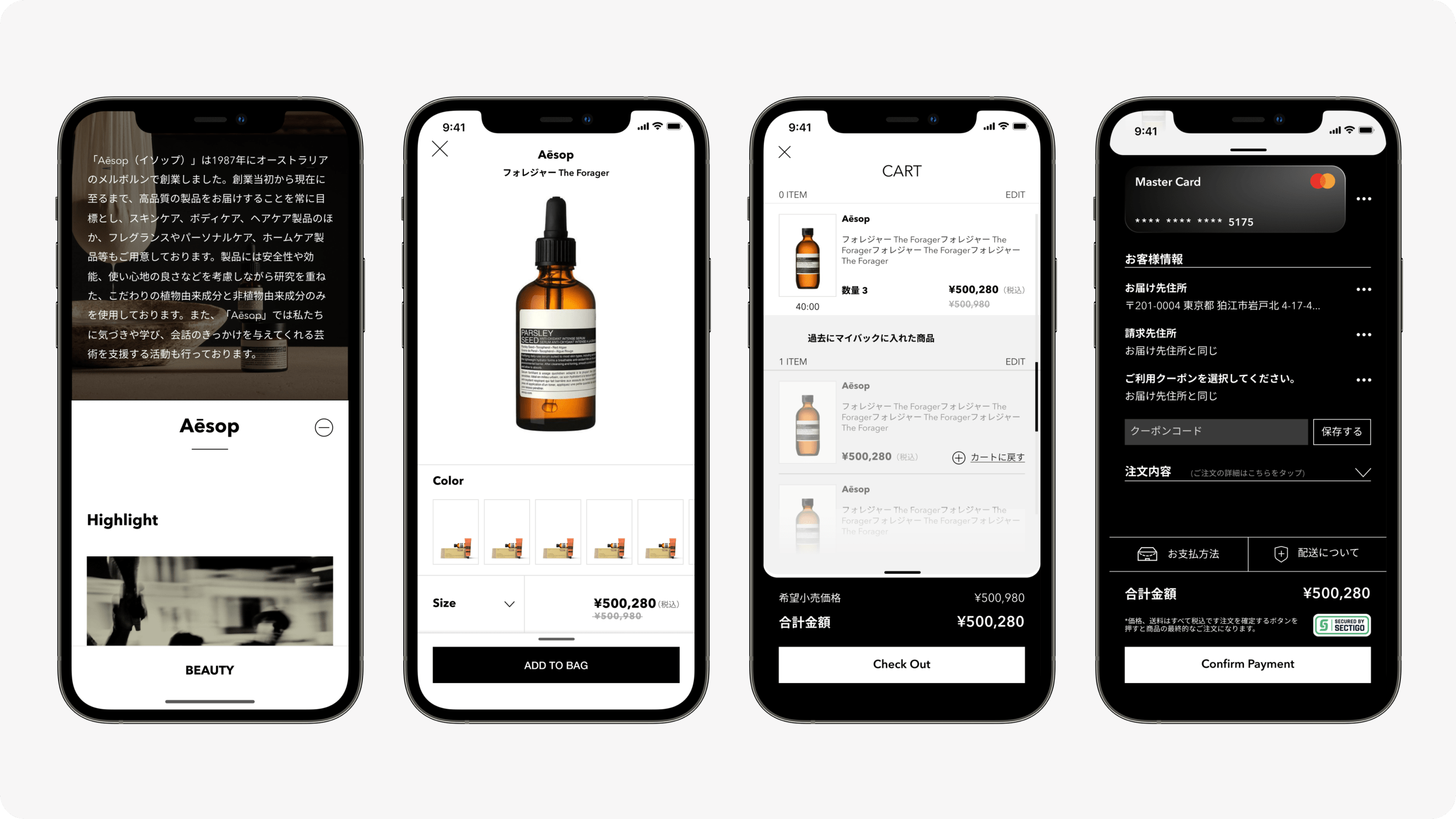
Product Listing, Product Detail, Cart, and Check Out
In the user main flow, we aimed for consistency by placing the main action button in the same location as the navigation action button. By maintaining this uniform placement for adding items to the shopping bag, proceeding to checkout, and confirming payments, we streamlined the user experience, making it easier for customers to transition seamlessly to the payment process. This strategic design choice significantly improved conversion rates for the company.
Product Listing and Coach Marks
Product Listing: Our product listing page offers a curated selection of the finest items in our collection. Each product is showcased with high-quality images and comprehensive descriptions, ensuring that users can make informed and delightful choices.
Coach Marks: To guide users through their first experience with our app, we've implemented interactive coach marks. These intuitive visual cues help users understand how to navigate the app, making it easier for them to get started.
Product Detail
Our Product Detail Page is thoughtfully designed as a series of cards, allowing users to seamlessly swipe left or right to explore a catalog of products. This intuitive design ensures that you can quickly and effortlessly view the next product, all within the same page, enhancing both convenience and image quality. We understand that users often have multiple items to browse, and this approach provides a superior shopping experience by minimizing the need to navigate to separate pages.
Cart
Our objective was to provide users with a convenient solution for items they might have second thoughts about or accidentally removed from their cart. This was especially important in the context of our scarcity timer for sale items. While the timer allowed others the opportunity to purchase limited stock items, it presented a challenge for users who may want to revisit or complete their purchase after the timer expired. To address this, we introduced a 'Saved Items' feature, ensuring that users don't need to search for the product again and can easily access their chosen items, even after the timer has elapsed.
Check Out and Thank You Message
Ensuring that our Checkout page functions as a pop-up was a deliberate choice driven by user convenience. We recognized that users often want the flexibility to edit, save, or remove items during the checkout process. With this design, users can easily edit their personal information, including payment details and address, and apply any available coupons, all within the pop-up interface.
The strategic placement of the main action button in a consistent location was another key consideration. By doing so, we anticipated that returning customers could complete their transactions with just two taps, streamlining the process.
Following the transaction, a 'Thank You' message provides essential details, allowing users to choose their next step, whether it's tracking their order or continuing to shop uninterrupted.
Moving Forward
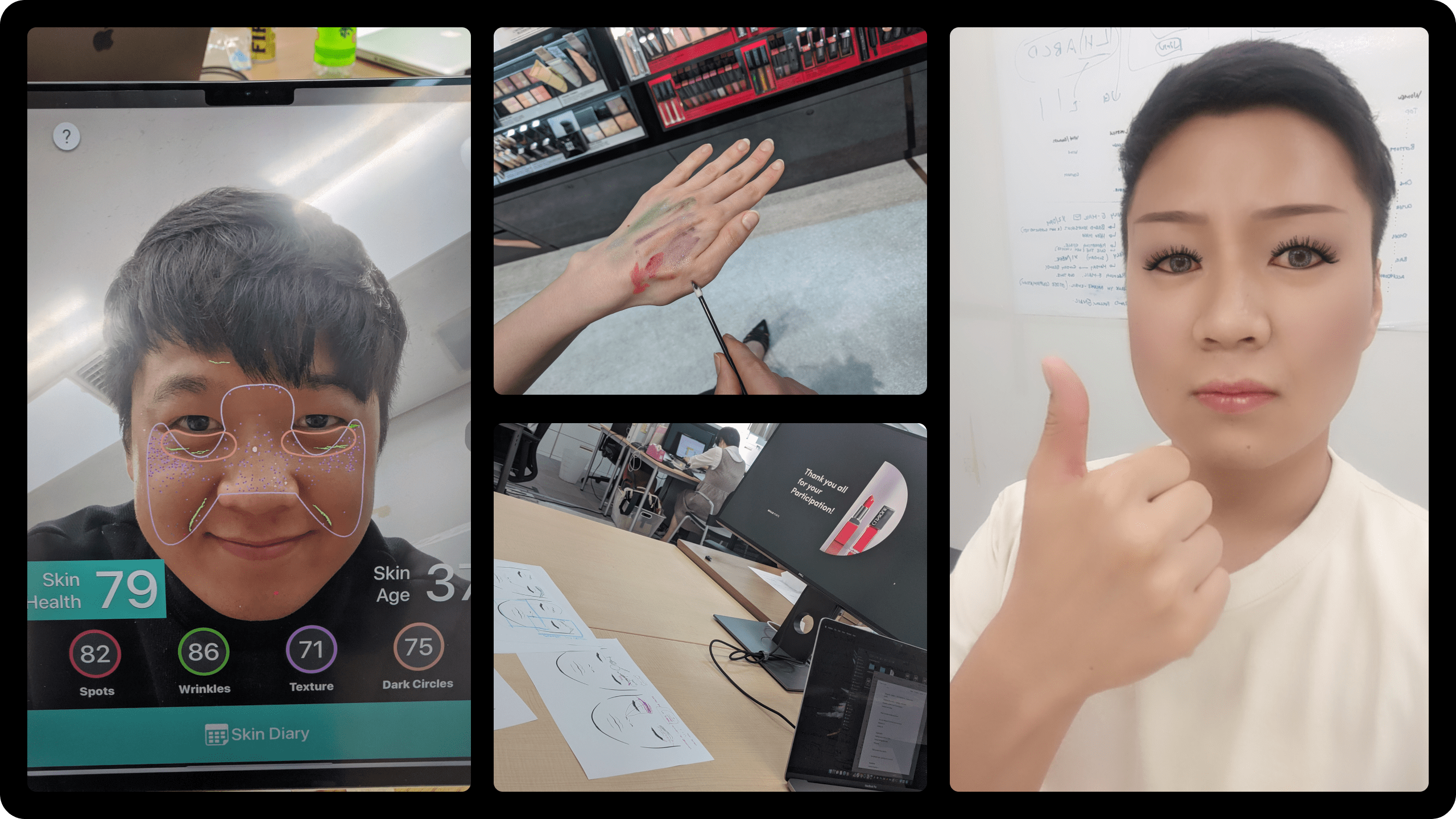
Beauty Product through Augmented Reality
It played a crucial role in enhancing the user experience by allowing customers to try on makeup, accessories, or fashion items in real time. We hope to see this feature not only boost user engagement but also empower shoppers to make more informed and satisfying purchase decisions. By integrating AR, we bridged the gap between the digital and physical shopping experience, providing a unique and immersive way for users to interact with our products.
Testing the Product AR
As a part of our development process, rigorous testing of the augmented reality (AR) features was conducted. This testing phase was integral in ensuring the seamless functionality and performance of AR components within our product. We focused on validating user interactions, AR object placement accuracy, and overall user experience to guarantee that the AR features delivered the immersive and reliable experience we envisioned for our customers.
Takeaway
Built but not launched
I played a pivotal role in designing a mobile app and collaborated closely with an iOS developer. While the app wasn't launched due to financial constraints during Series B, this experience enriched my skills in Apple Human Interface Guidelines (IHG), iOS platform understanding, accessibility, and user-centered design. It was a significant step in my journey as a product designer in the fashion industry.
Selected Works
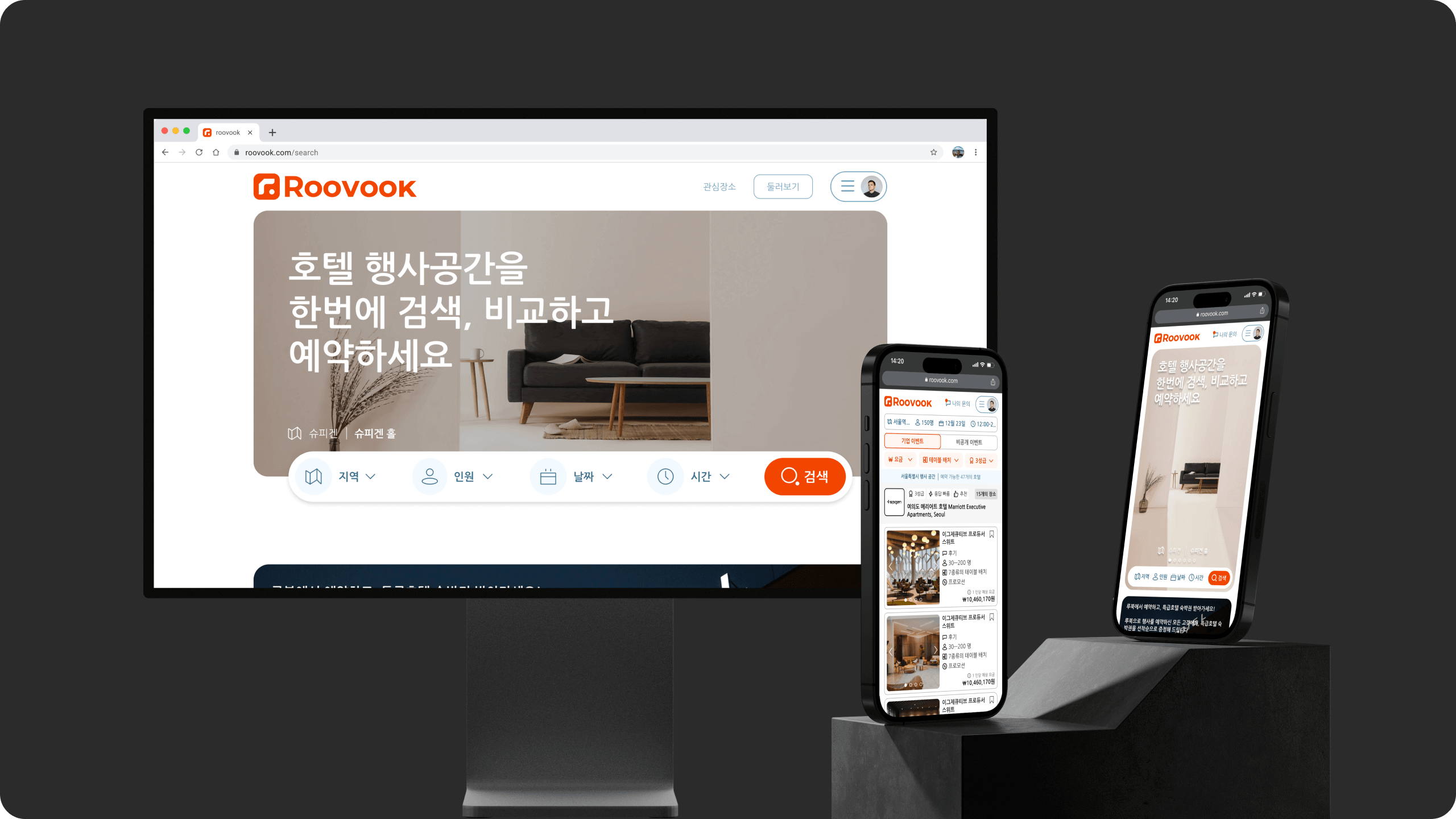
RoovookProduct Design
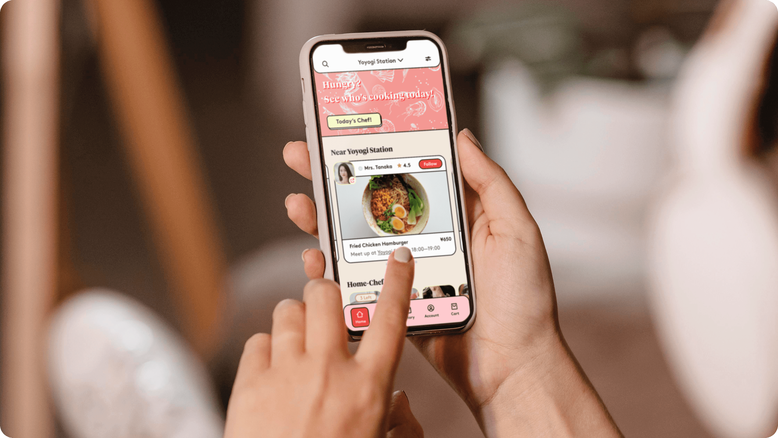
hidozoProduct Design
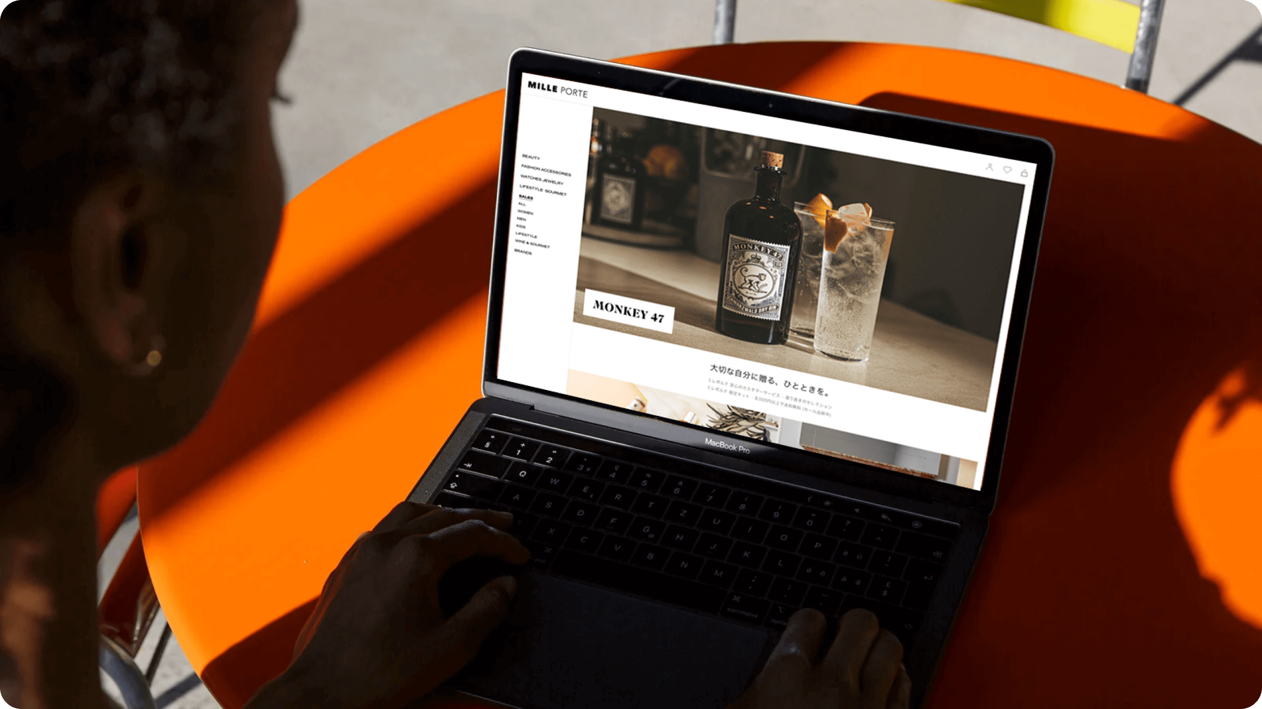
MilleporteProduct Design
Milleporte iOS AppProduct Design
Ji Kim
Product Designer
© 2023
